Client
Hank’s Fried Chicken
Projects
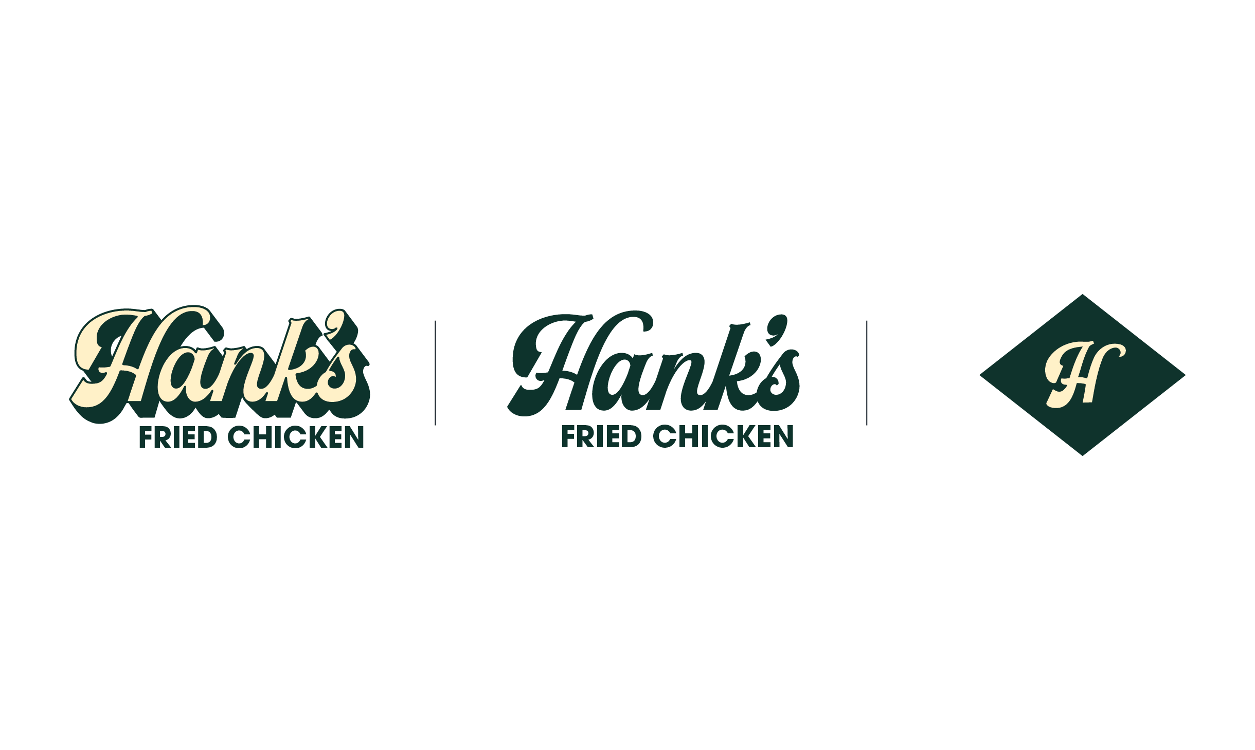
Logo Design
Credits
Agency: Trailhead Creative
CD: James Moffitt/Rob Wooten
GD: Summer Markham
Overview
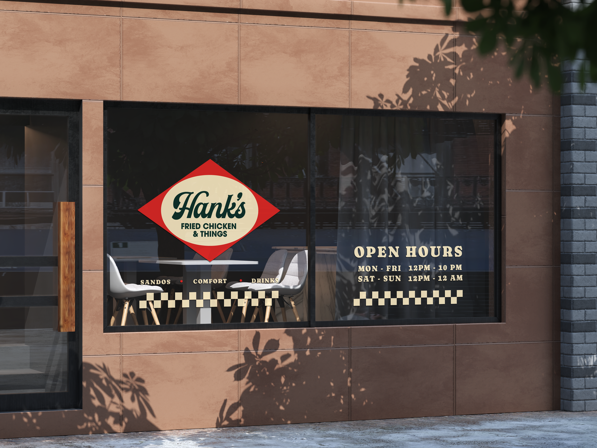
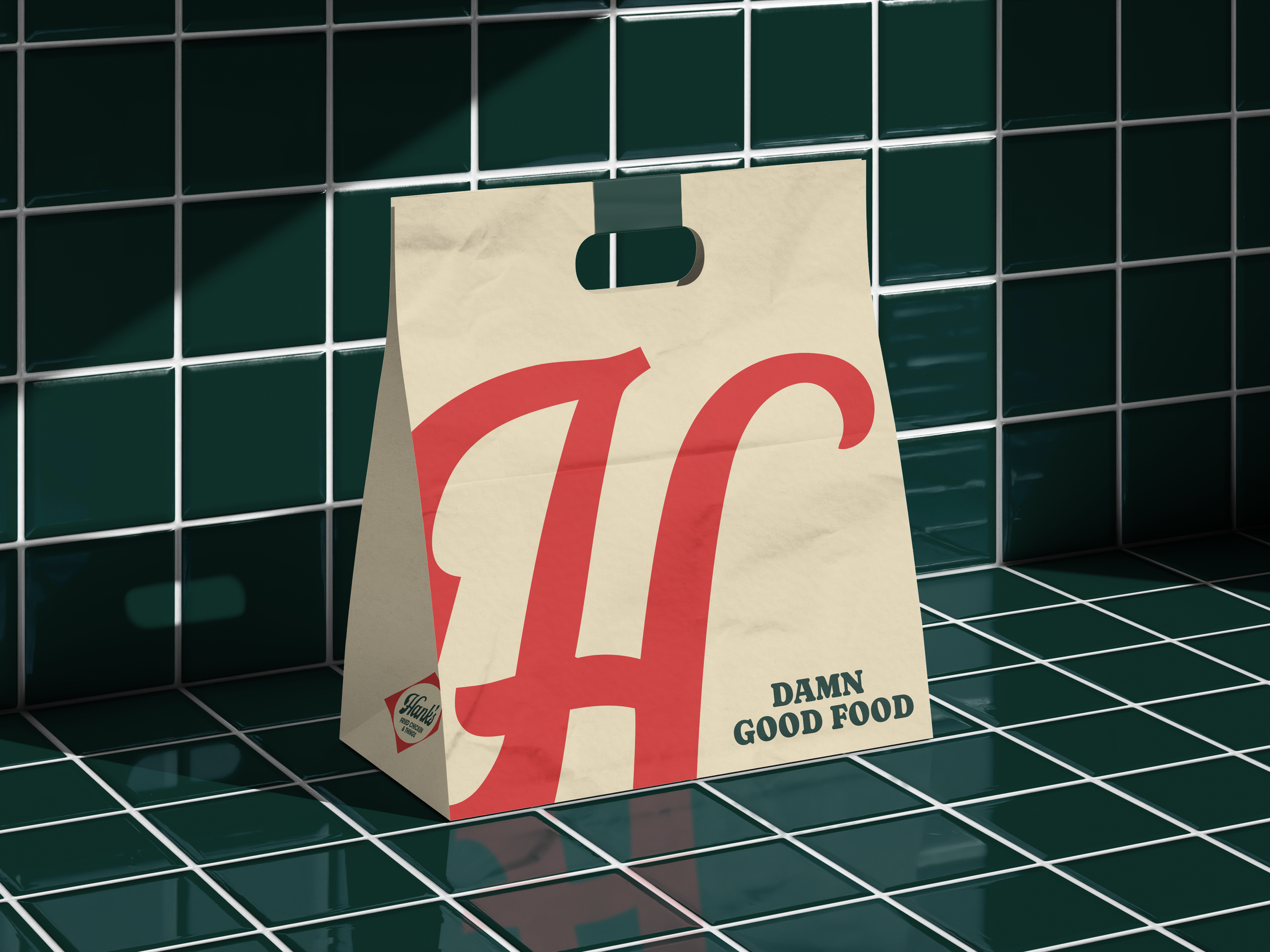
Hank’s Fried Chicken exists to fuel and feed the active and creative community with the best fried chicken sandwich on the East Coast while remaining fully inclusive of dietary restrictions. The brand is built on from-scratch cooking, uncompromising quality, and equal-care vegan and dairy-free counterparts that ensure everyone can share the same experience. Rooted in Southern food tradition, and countercultural creativity, Hank’s supports art, music, and skateboarding communities through events, partnerships, and direct reinvestment. By putting people, craft, and community first, Hank’s turns a single great chicken sandwich into a platform for cultural connection and positive impact.
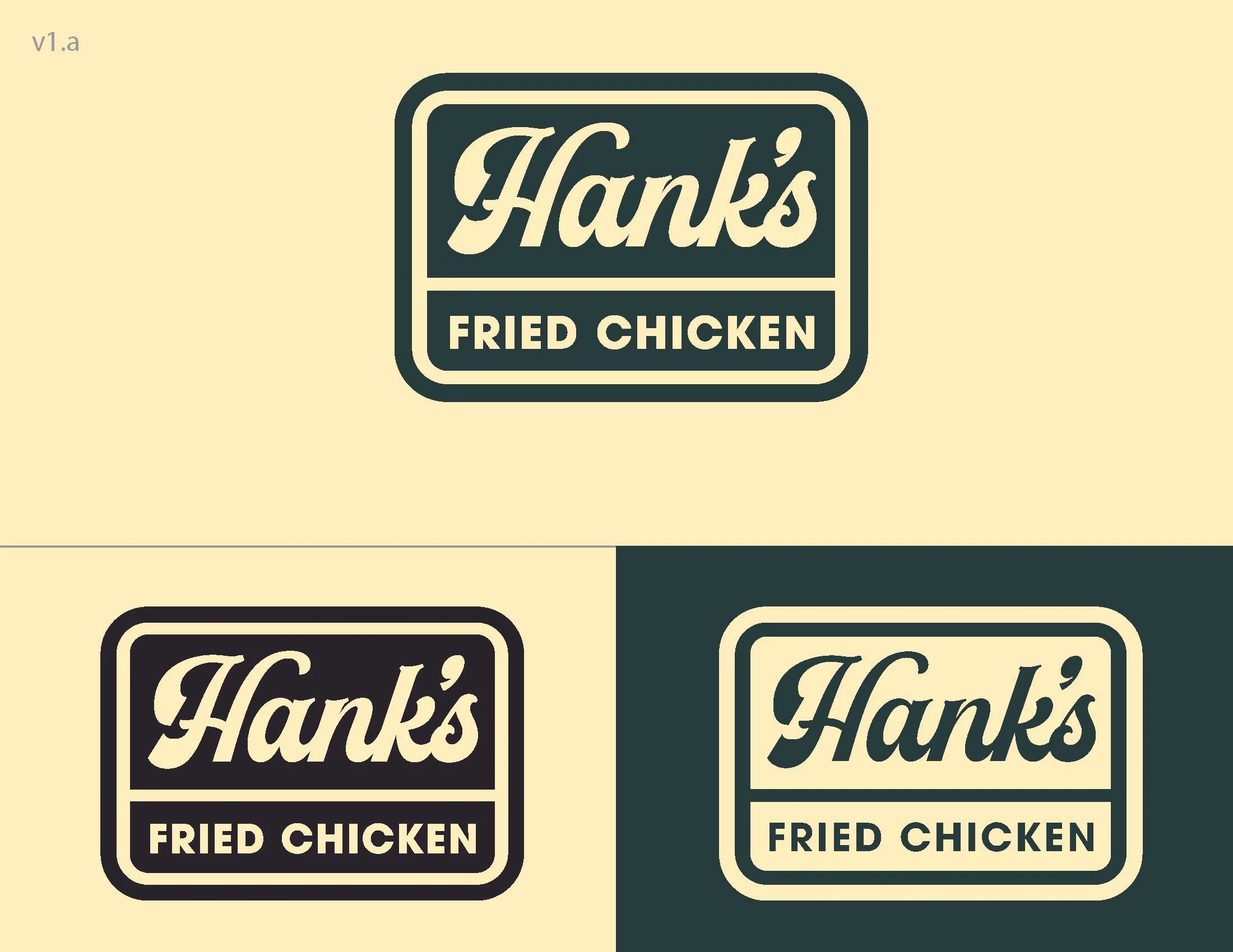
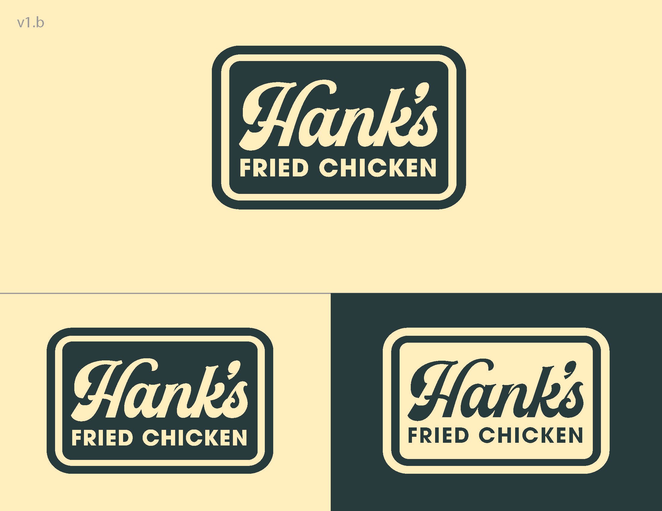
An Expression of Reliability
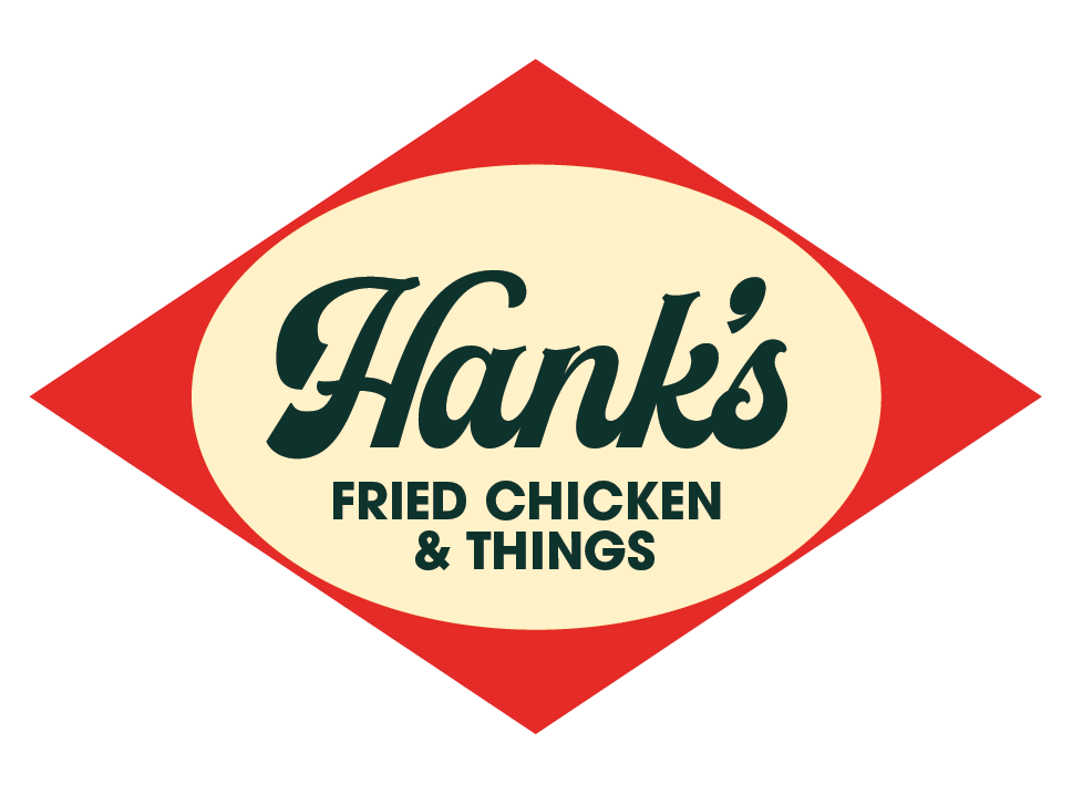
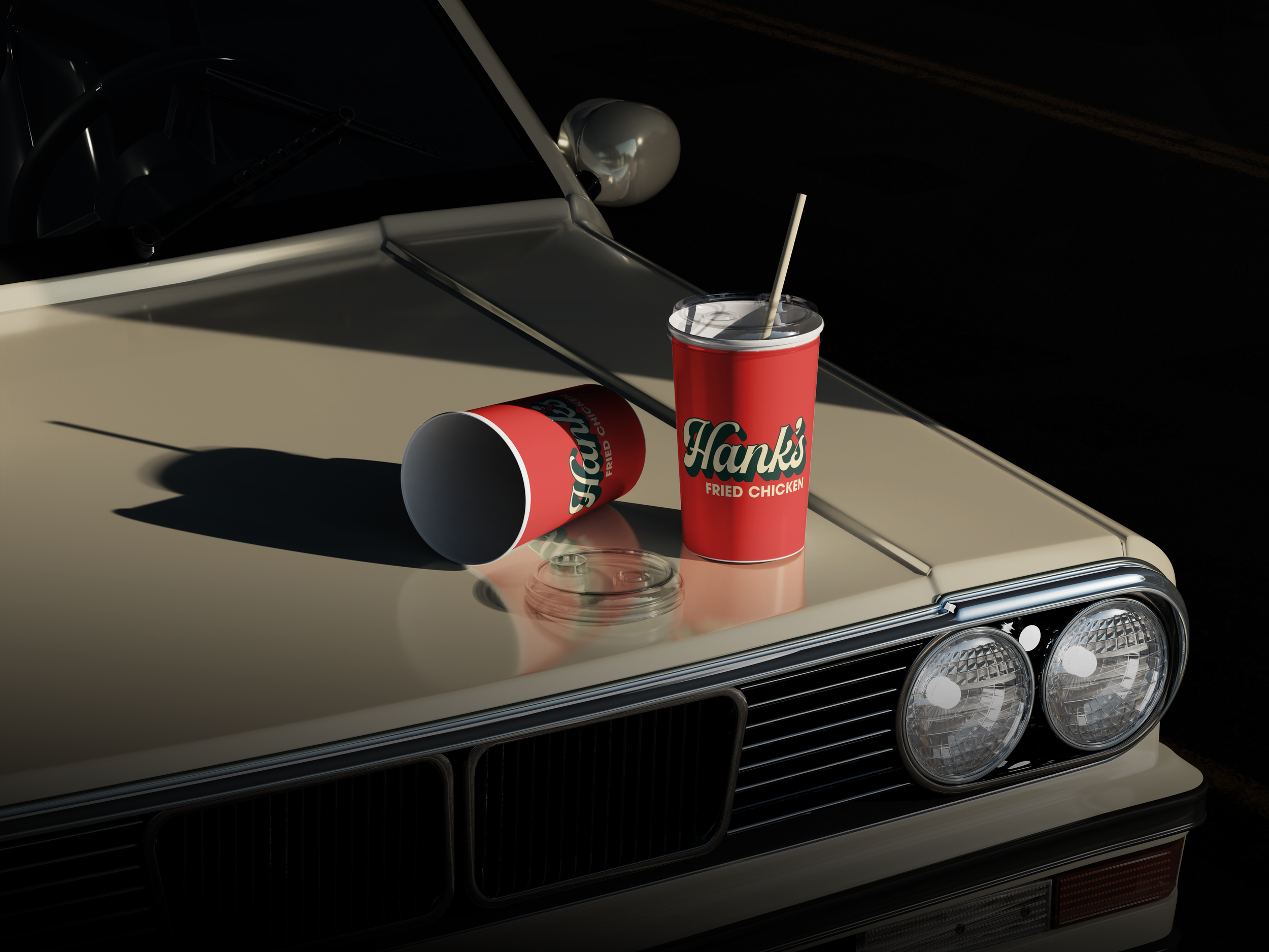
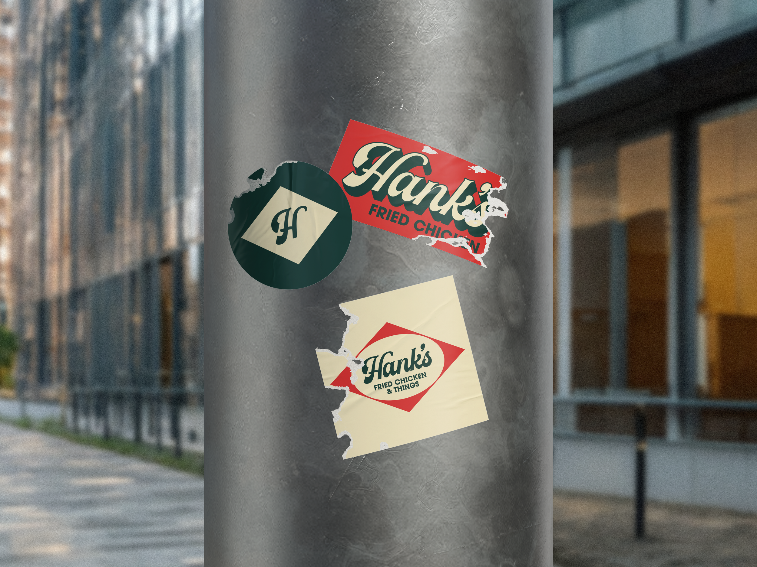
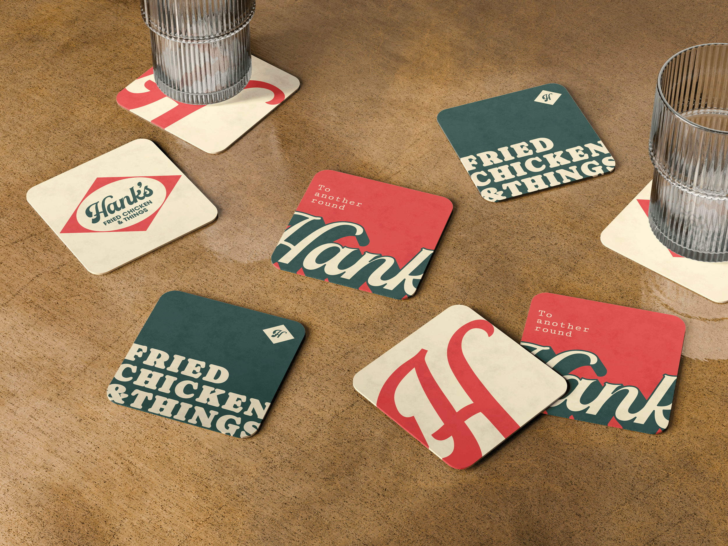
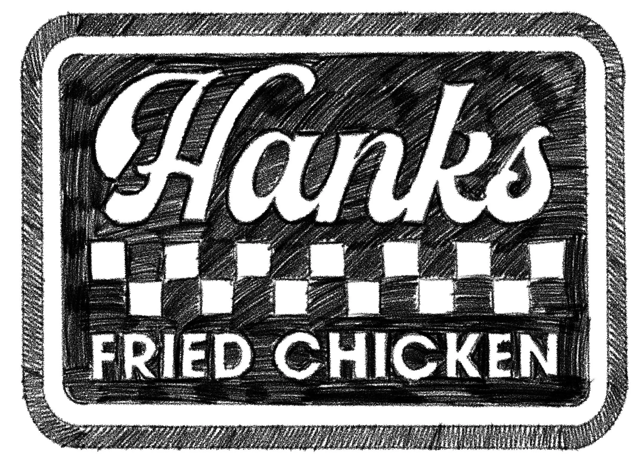
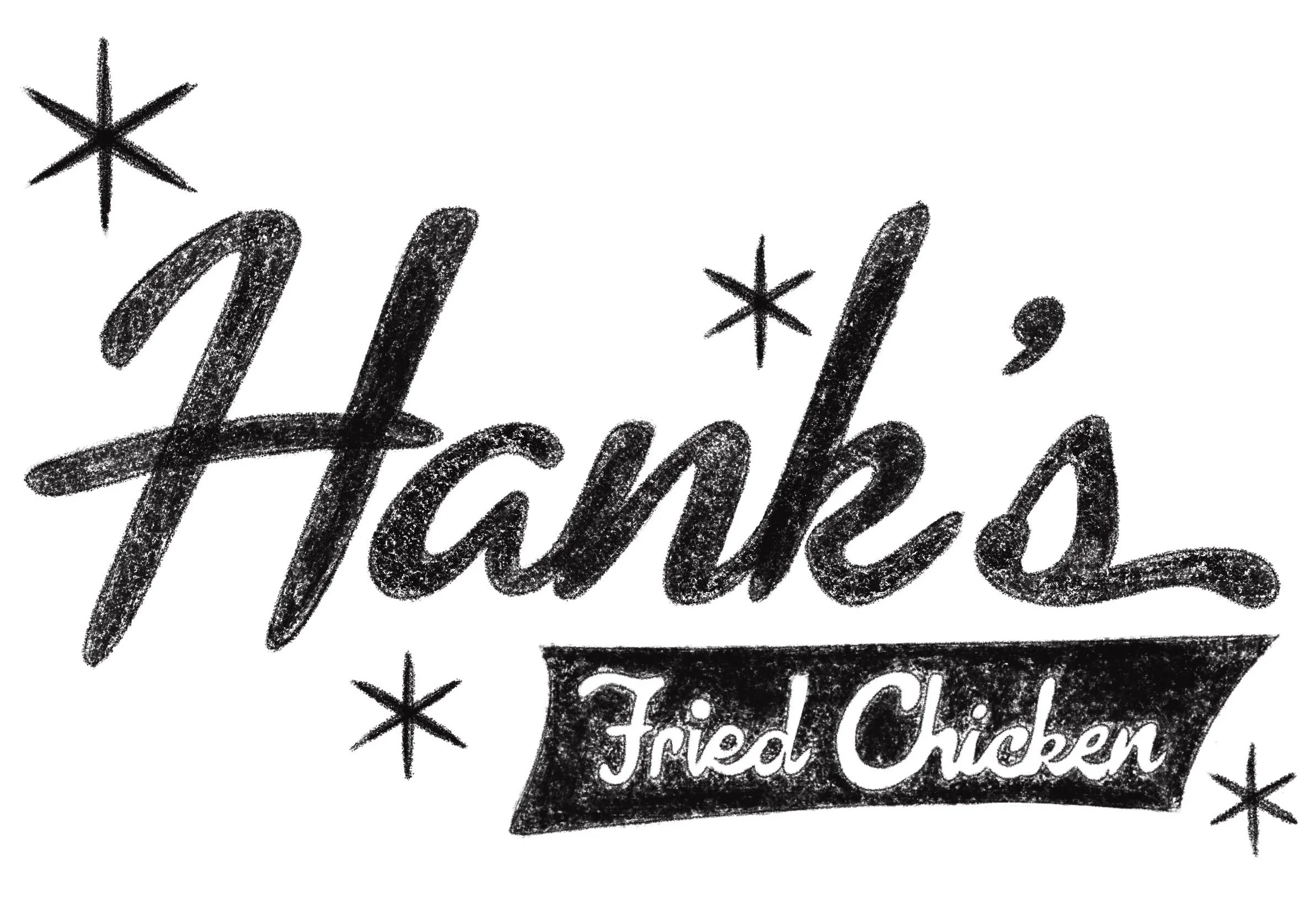
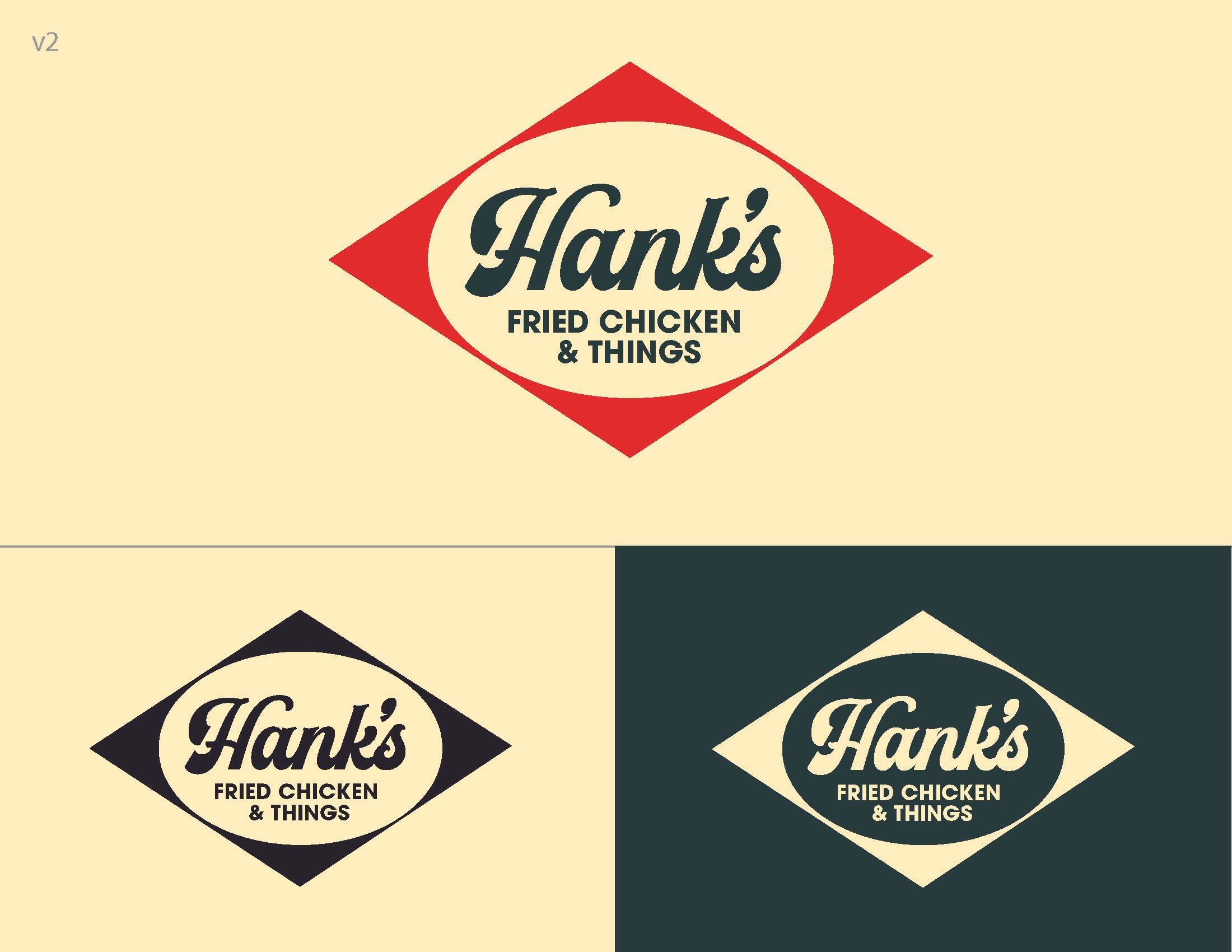
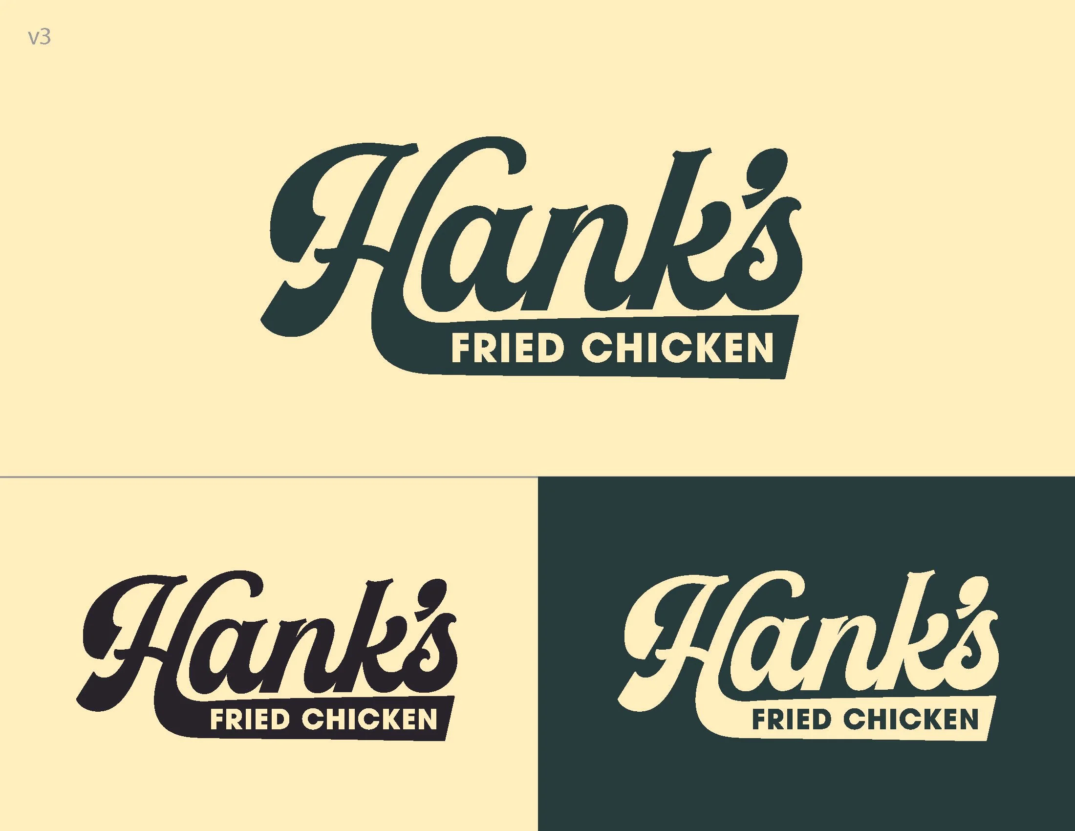
Hank’s Fried Chicken is a community-driven restaurant rooted in familiarity, comfort, and approachability; qualities that are reflected throughout its logo. The bold diamond shape and warm color palette evoke a sense of tradition and neighborhood charm, while the hand-drawn script conveys friendliness and authenticity. Together, these elements create a welcoming mark that feels established and trustworthy, reinforcing Hank’s role as a reliable gathering place for good food and good company.
Research & Development
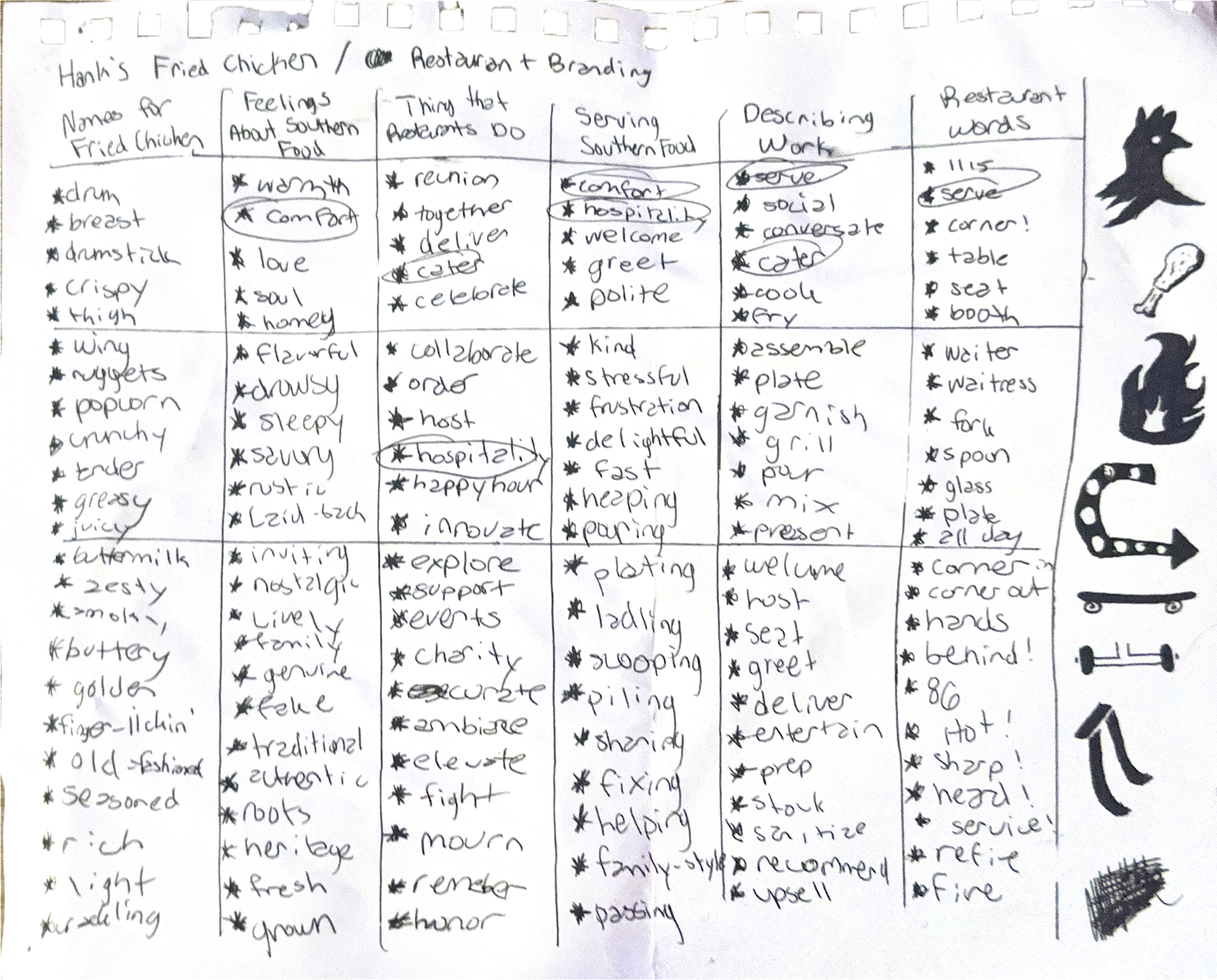
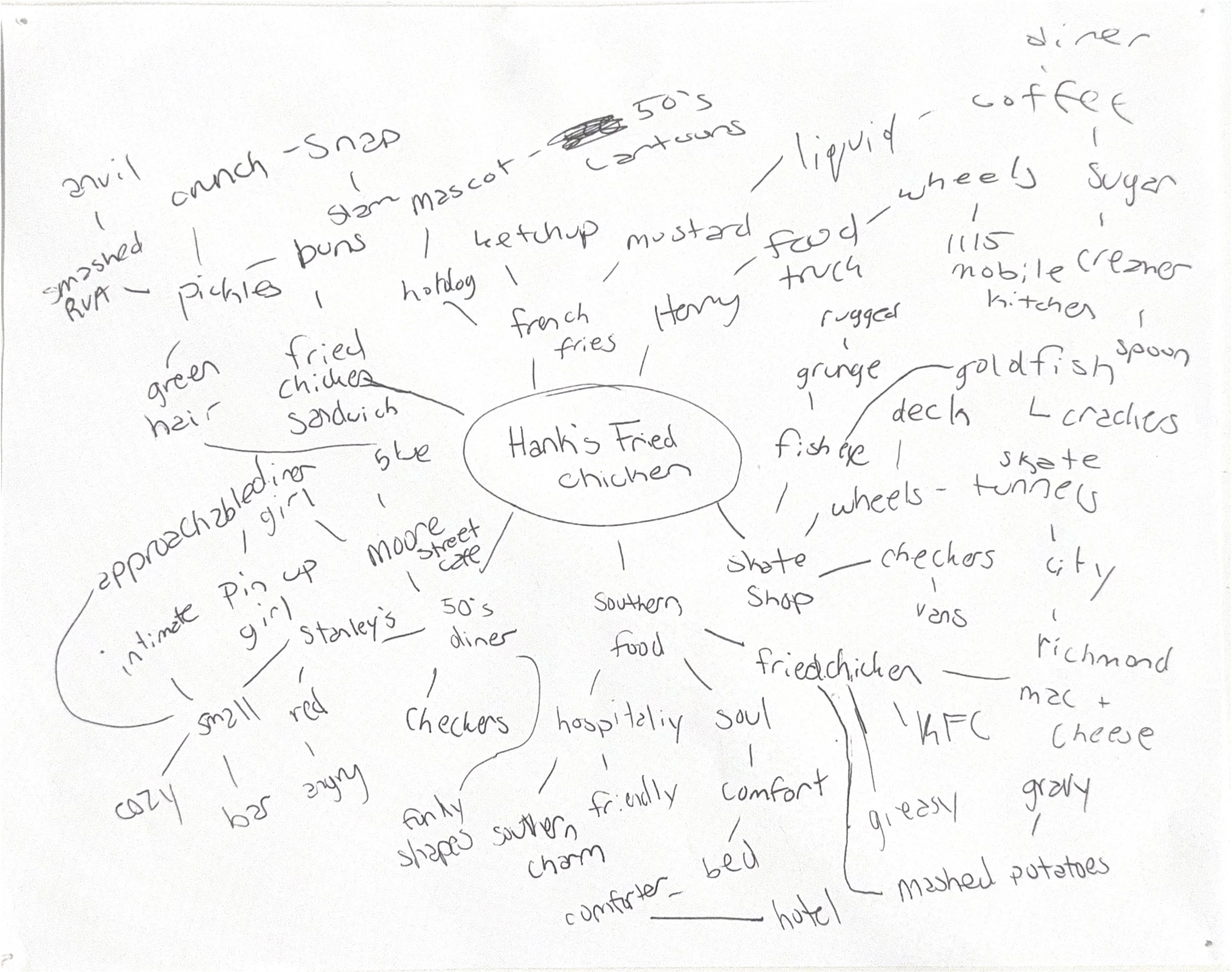
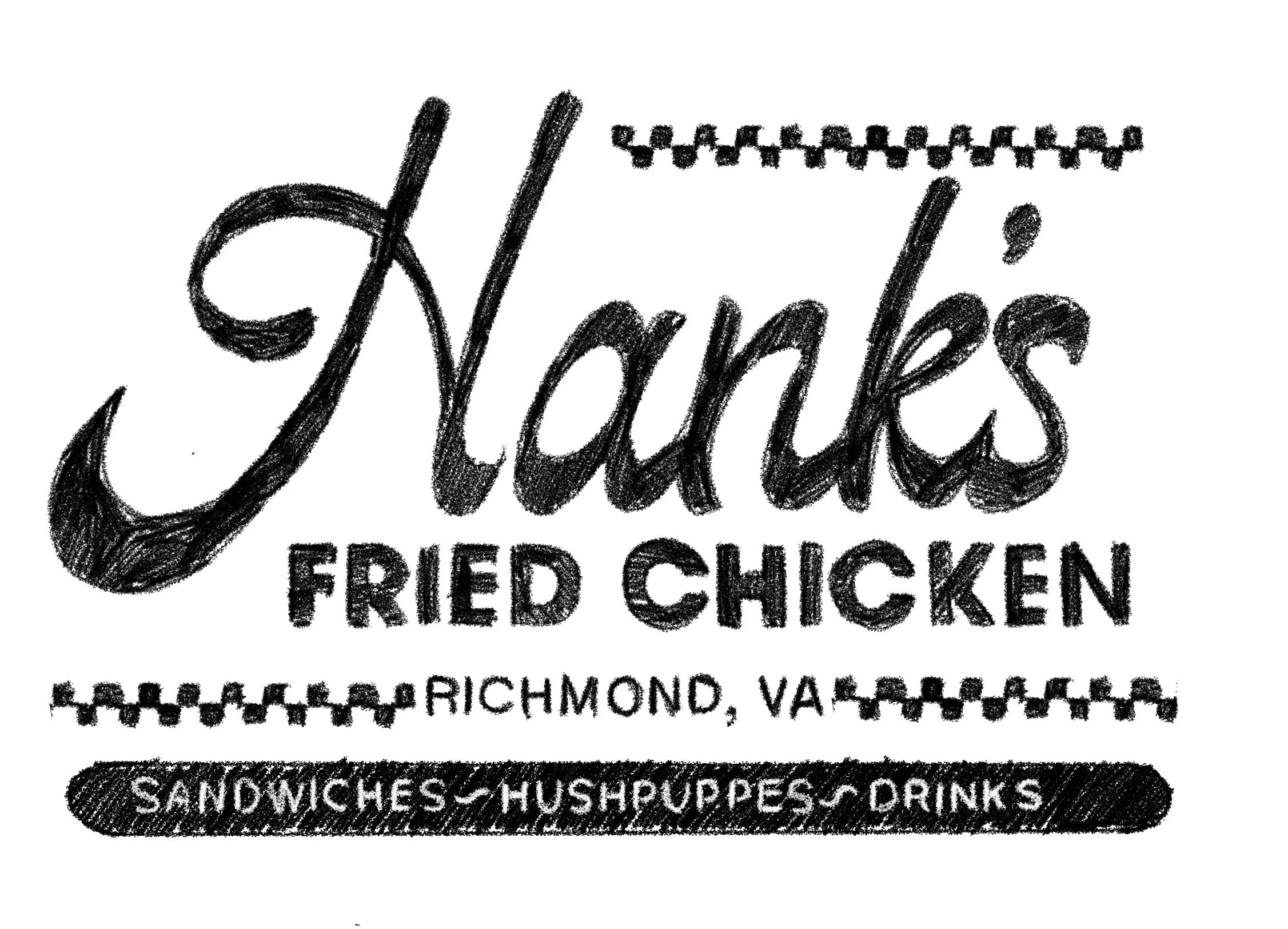
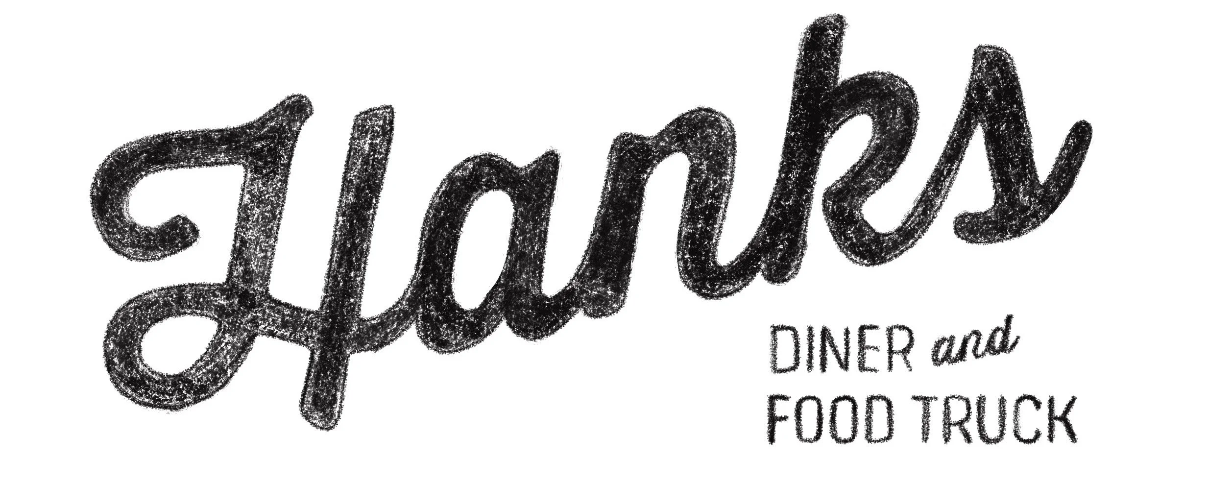
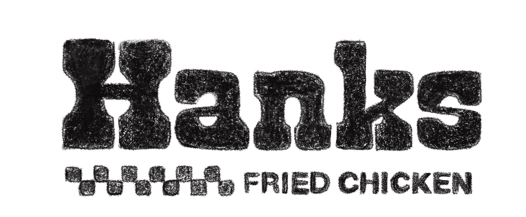
Research and development began with gathering valuable insights through targeted client surveys. Initial concept sketches were then developed to explore a range of creative directions. From there, digital thumbnails were produced to refine and visually articulate the strongest concepts, allowing for focused review and feedback from clients.
Rinse & Repeat
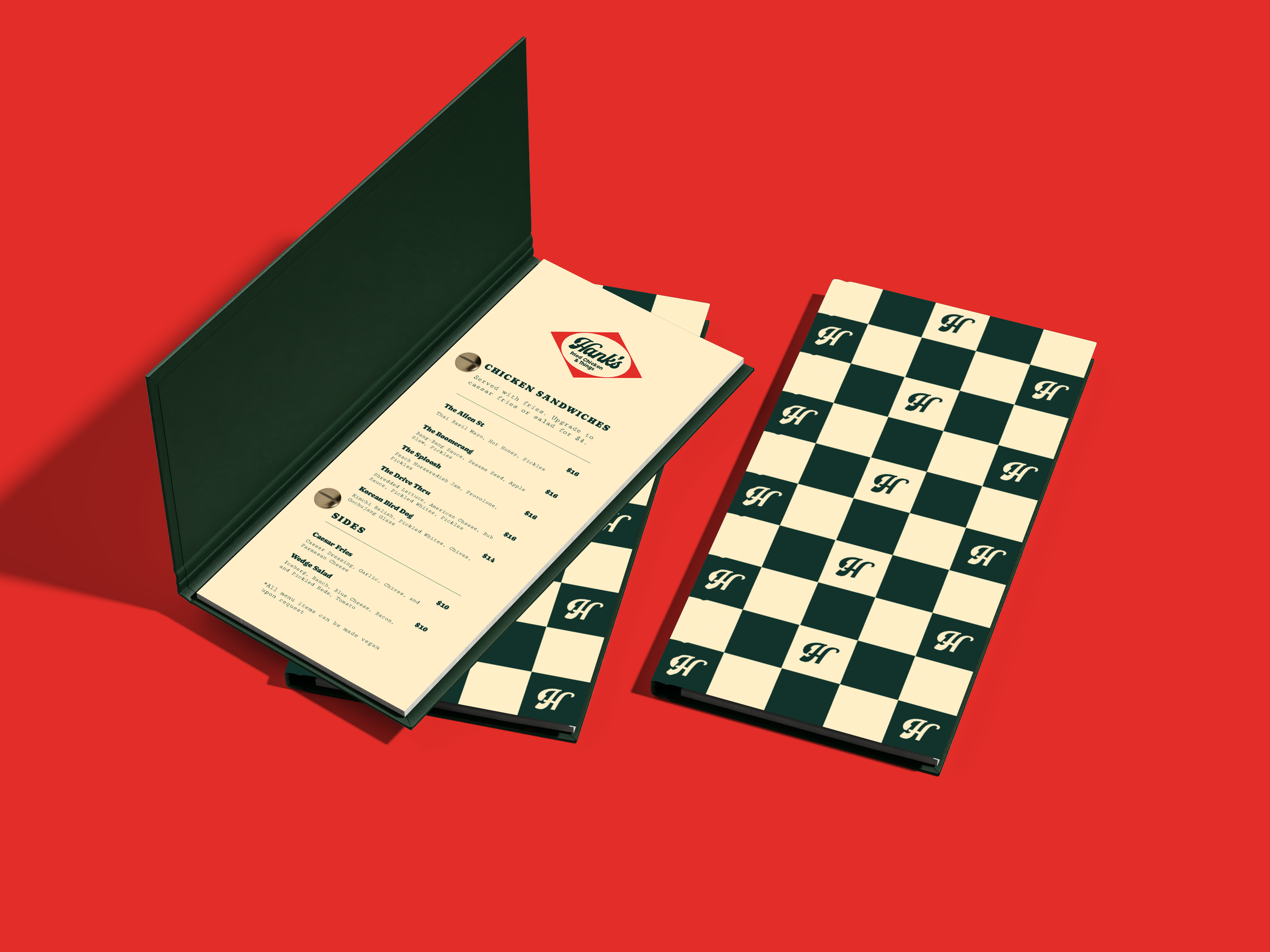
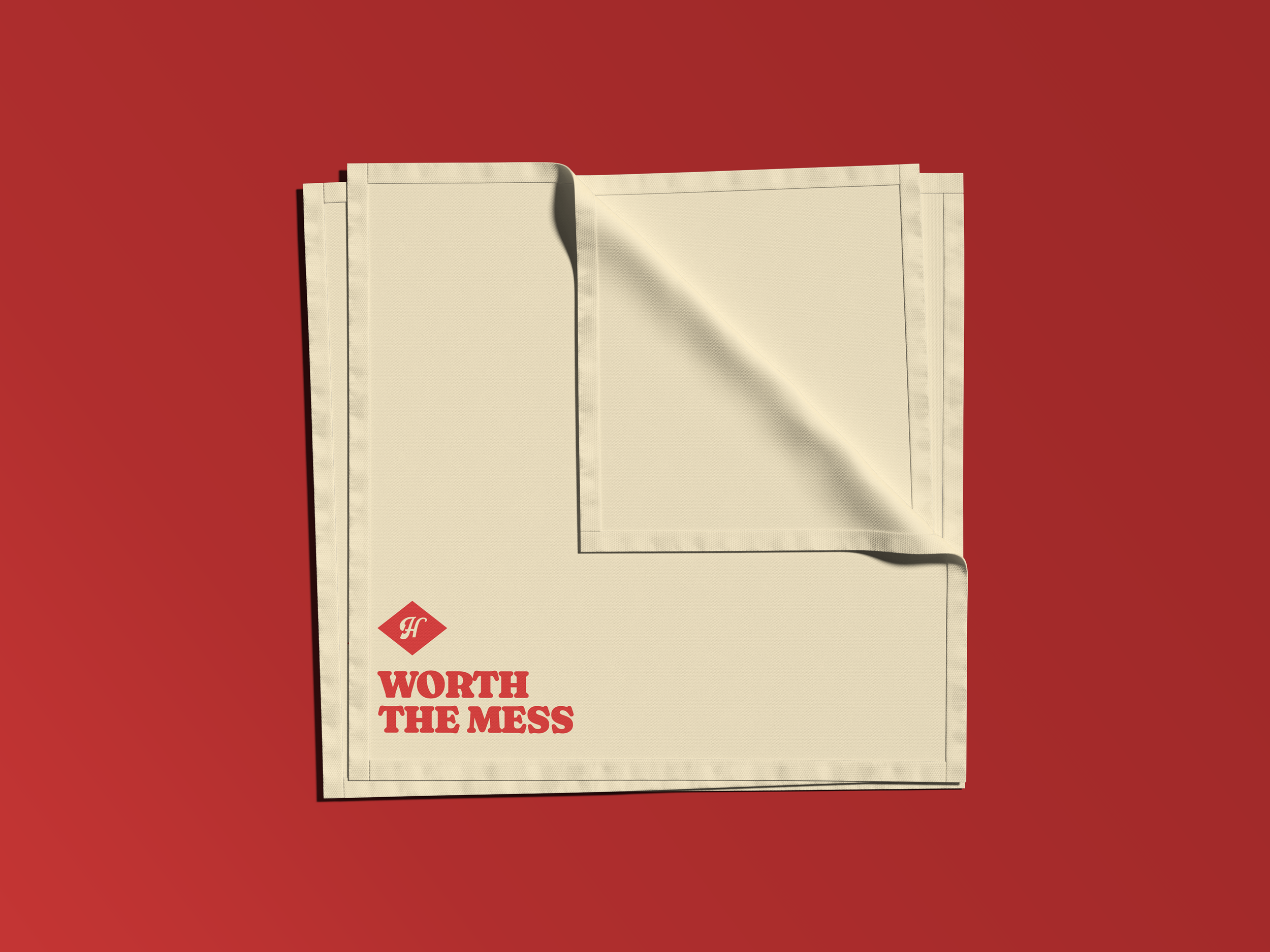
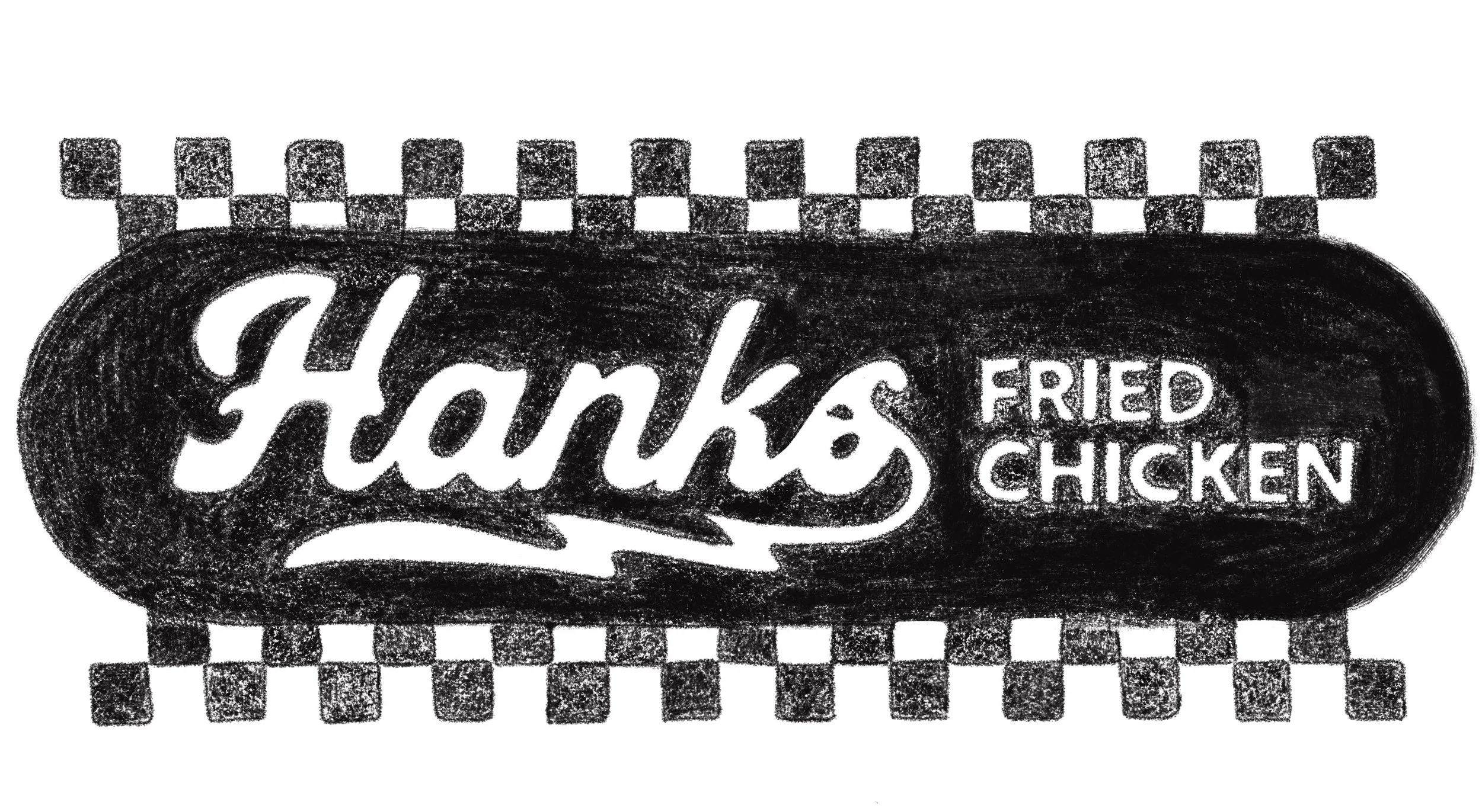
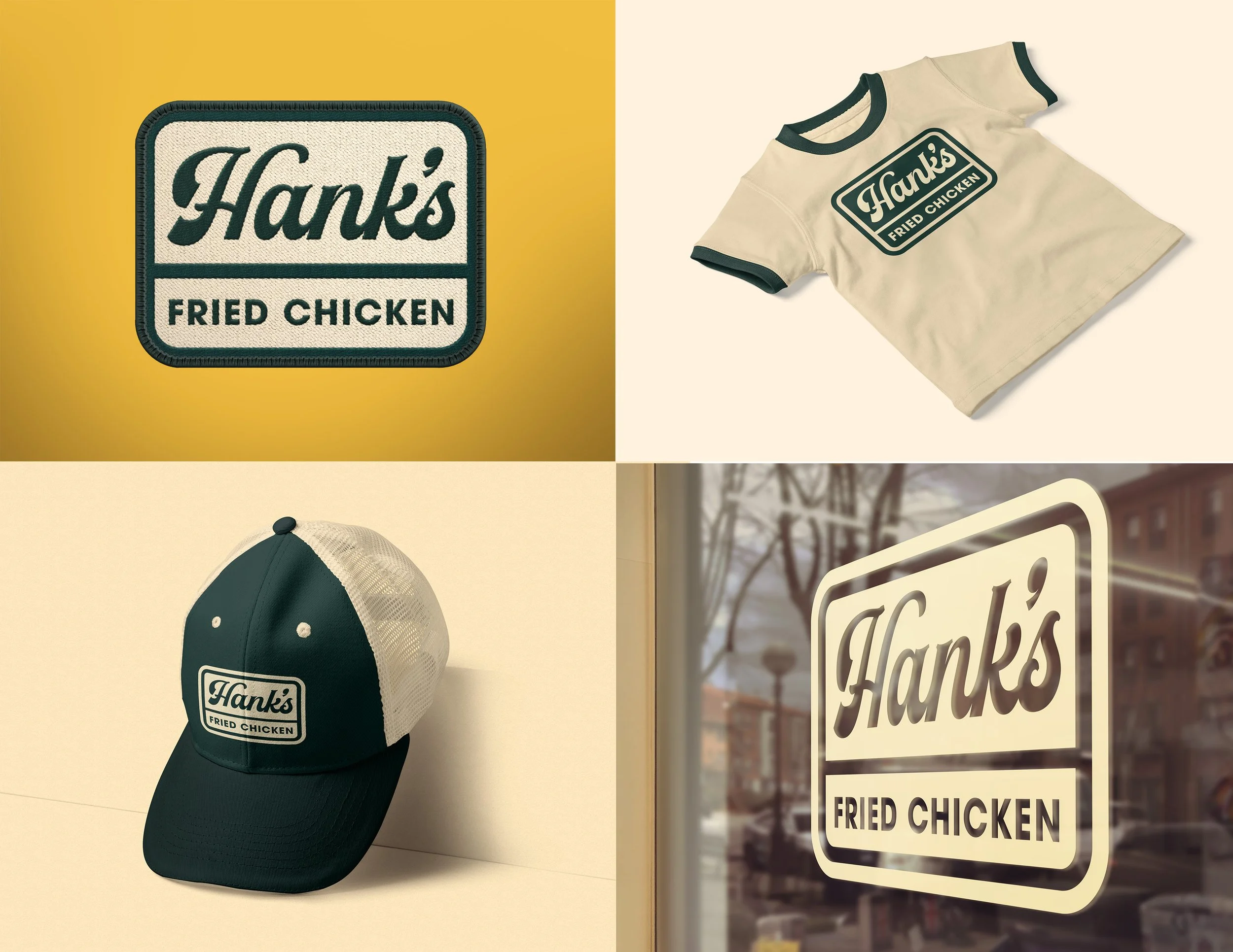
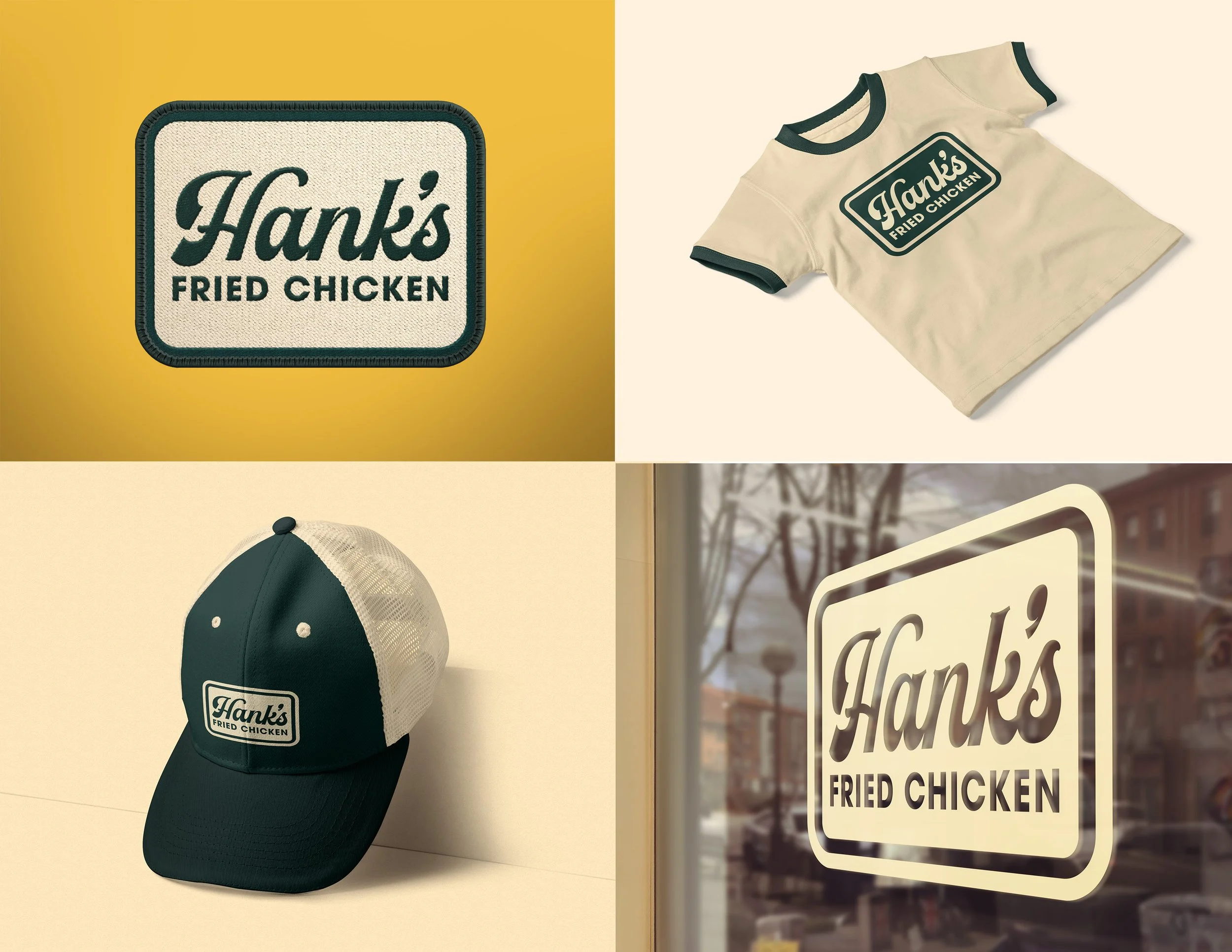
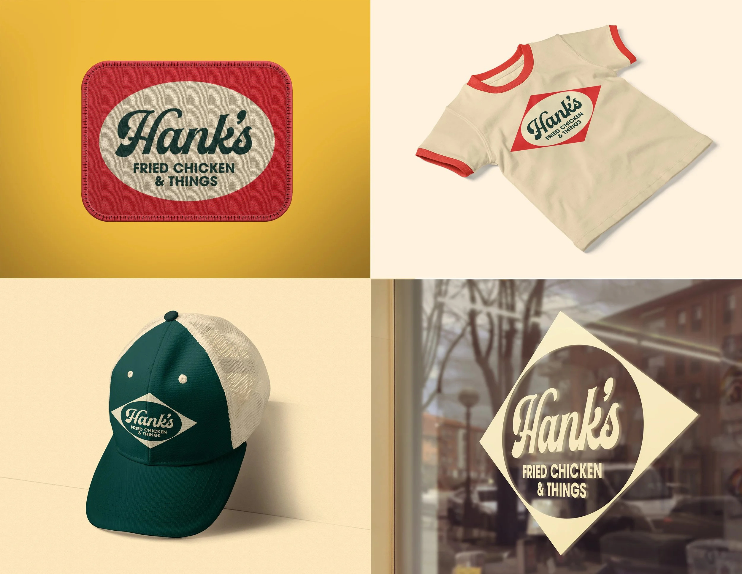
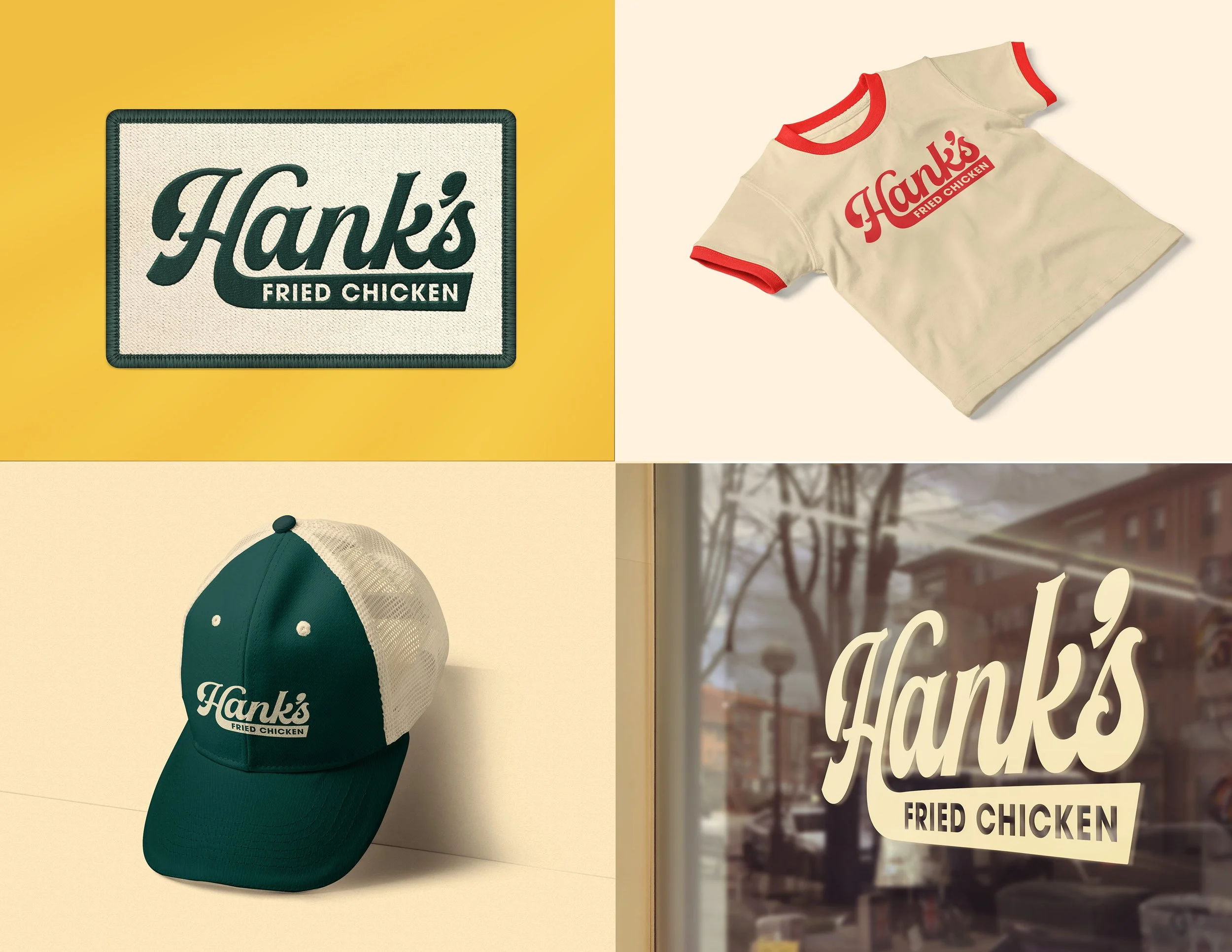
After reviewing the client’s feedback, we incorporated their input and offered additional recommendations throughout the refinement process. We developed mockups of the selected concepts to clearly demonstrate the logo’s functionality across various applications. This approach allowed the client to better visualize real-world usage and assess versatility. The iterative process ensured the final design aligned seamlessly with both the brand vision and practical requirements.
Reflection
Aligning with the client in both vision and aesthetics was incredibly beneficial because it created clarity, confidence, and cohesion throughout the entire process. From the outset, we shared the understanding that Hank’s Fried Chicken was not just about serving food, but about building community, honoring Southern tradition, and fostering inclusivity through thoughtful, from-scratch cooking and equal-care vegan and dairy-free options.
Because we were aligned on these core values, every design decision felt purposeful rather than forced, and the visual identity naturally reflected the brand’s warmth, authenticity, and neighborhood-driven spirit. This mutual understanding eliminated unnecessary friction, allowed creativity to flow more freely, and ensured that the final result was not only visually compelling but also strategically grounded.
The alignment strengthened the brand’s foundation, making it easier to communicate trust, approachability, and cultural connection in a way that feels genuine and sustainable as Hank’s continues to grow.