Client
The Fleming Preserve
Projects
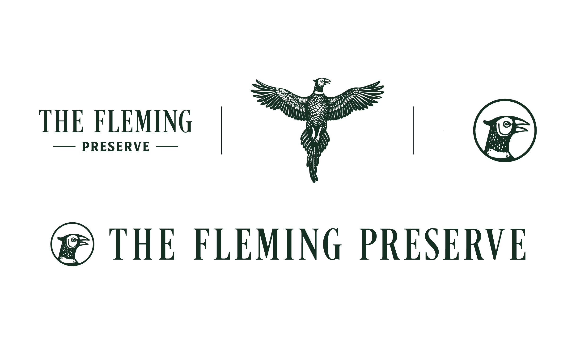
Logo Design
Awards
GDUSA Award 2025 in Branding + Identity
Credits
Agency: Trailhead Creative
CD: James Moffit/Rob Wooten
GD: Summer Markham
Overview
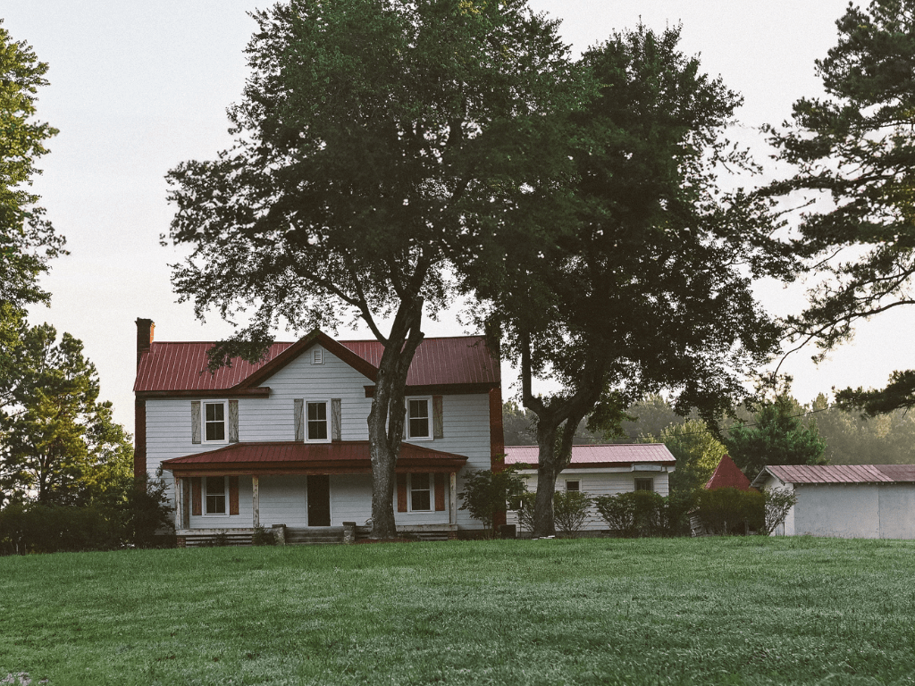
Met by soaring southern yellow pines and a historic 200-year-old estate, The Fleming Preserve envelops guests in a rich history, set against the backdrop of the natural world. From a welcome at the lodge to a warm-up session of clays before the hunt, guests will enjoy mixed terrain hunting with expert and friendly guides across the sprawling estate before retiring to the lodge for refreshments.
Established in Stewardship and Sport
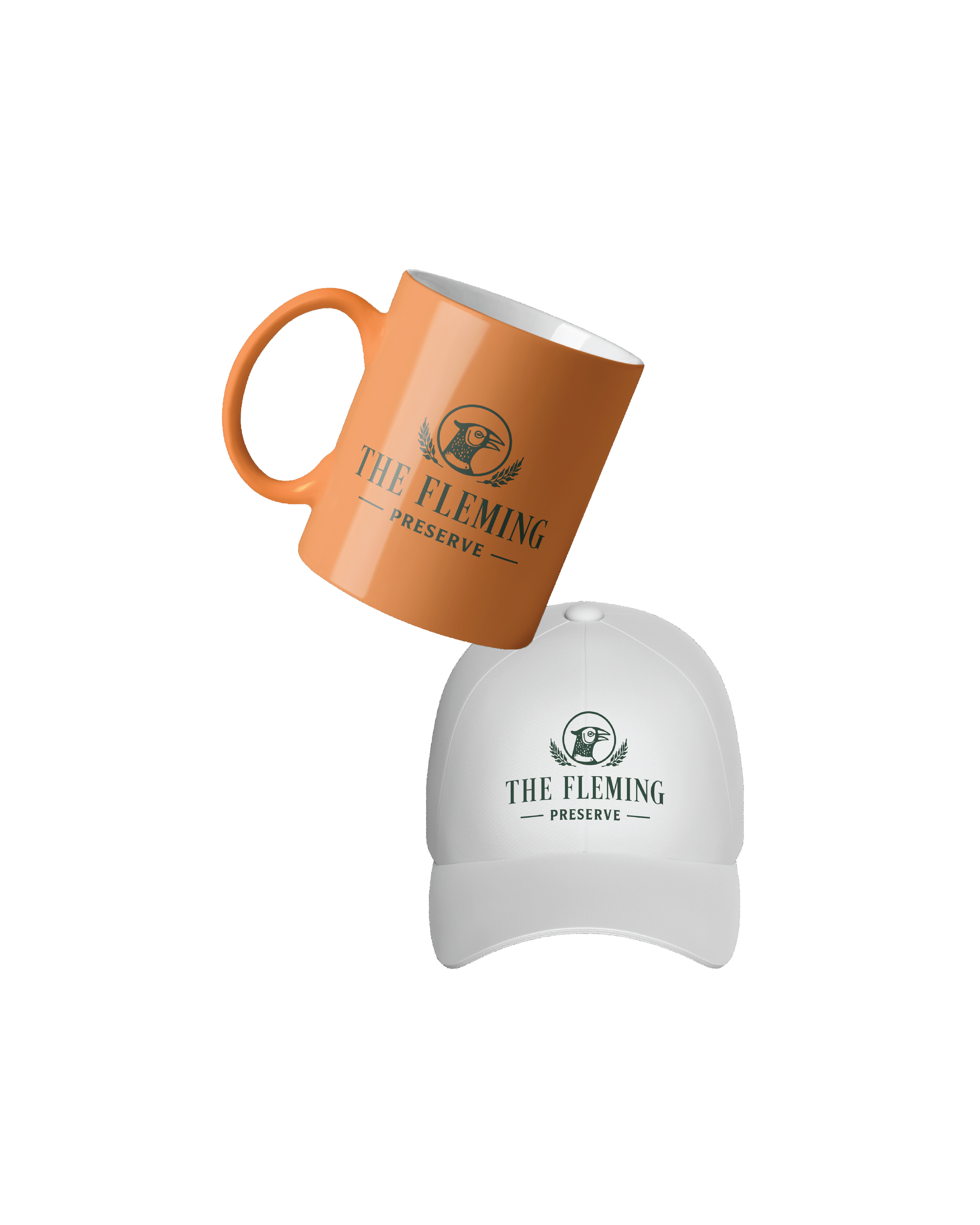
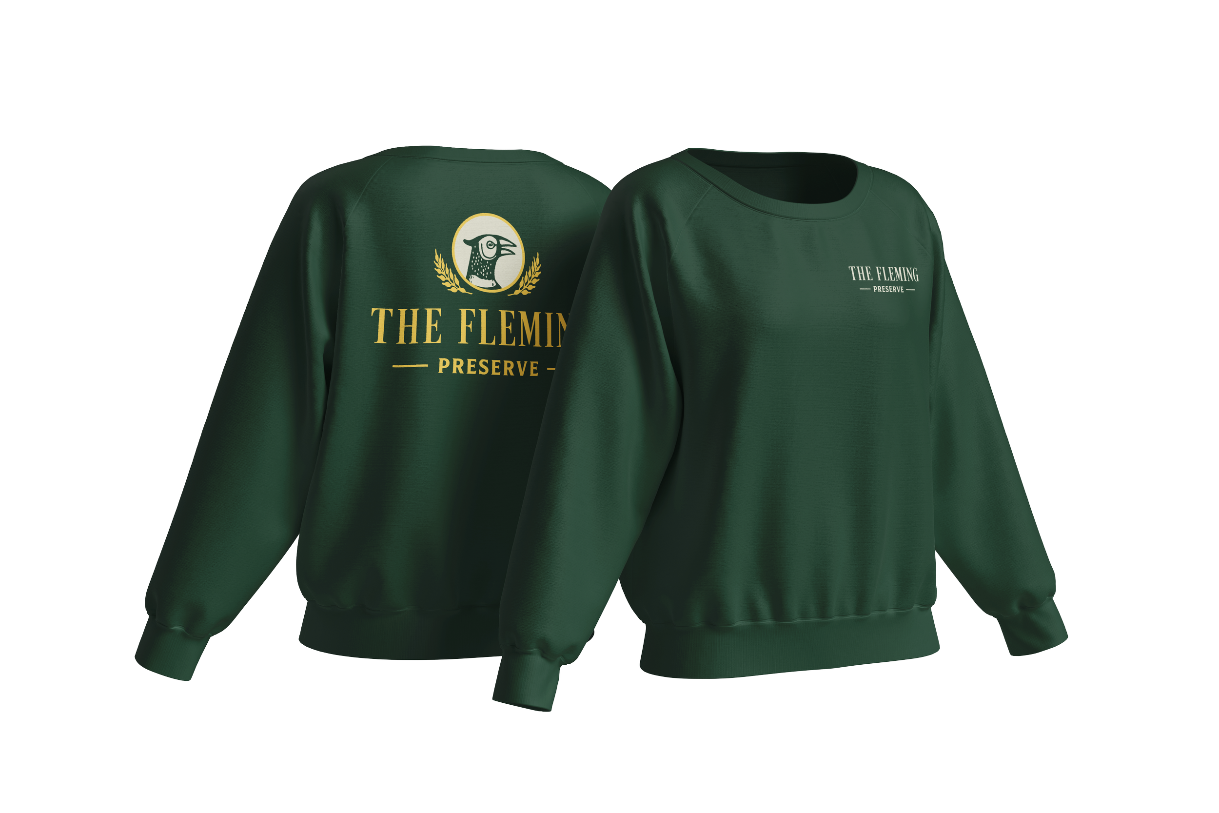
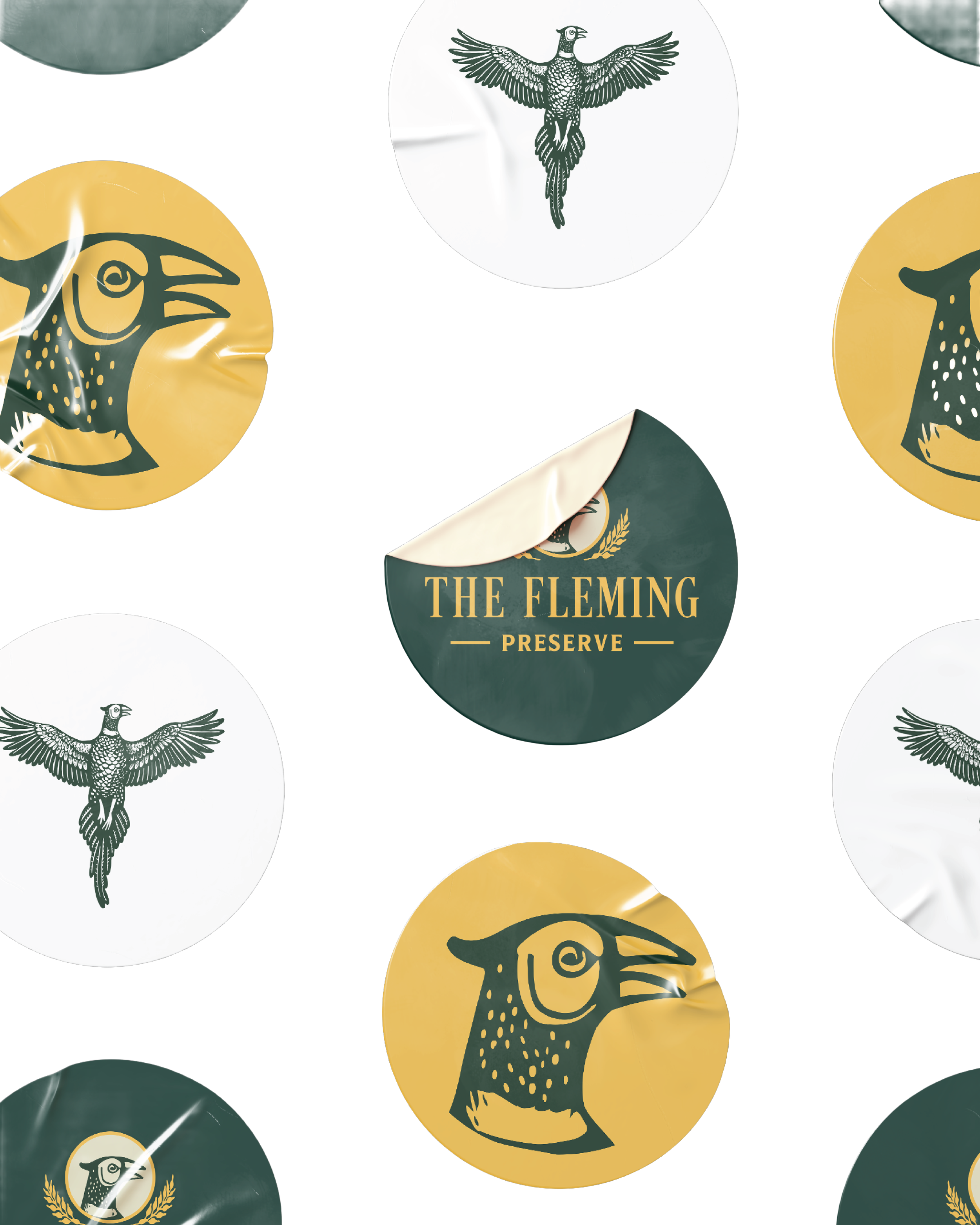
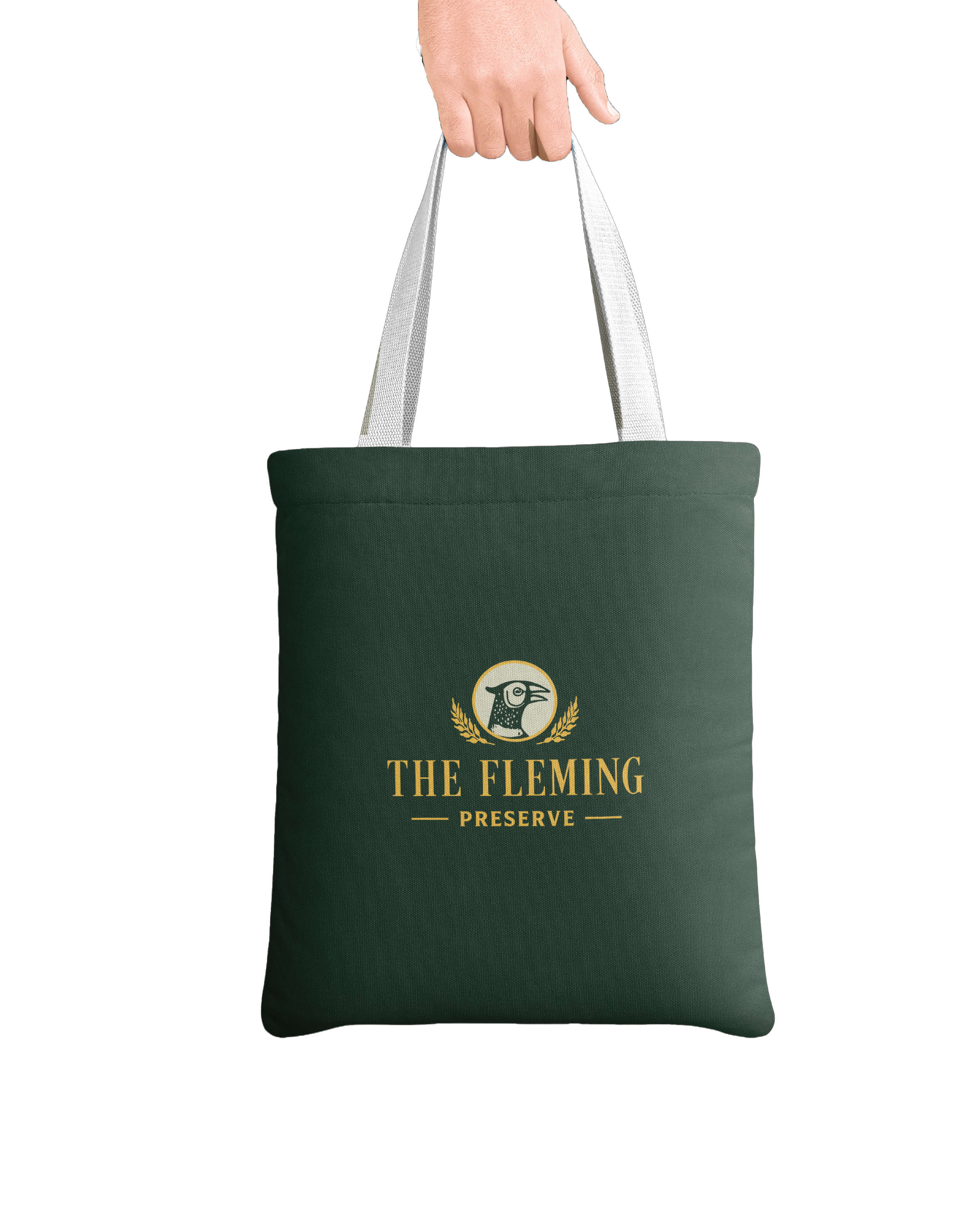
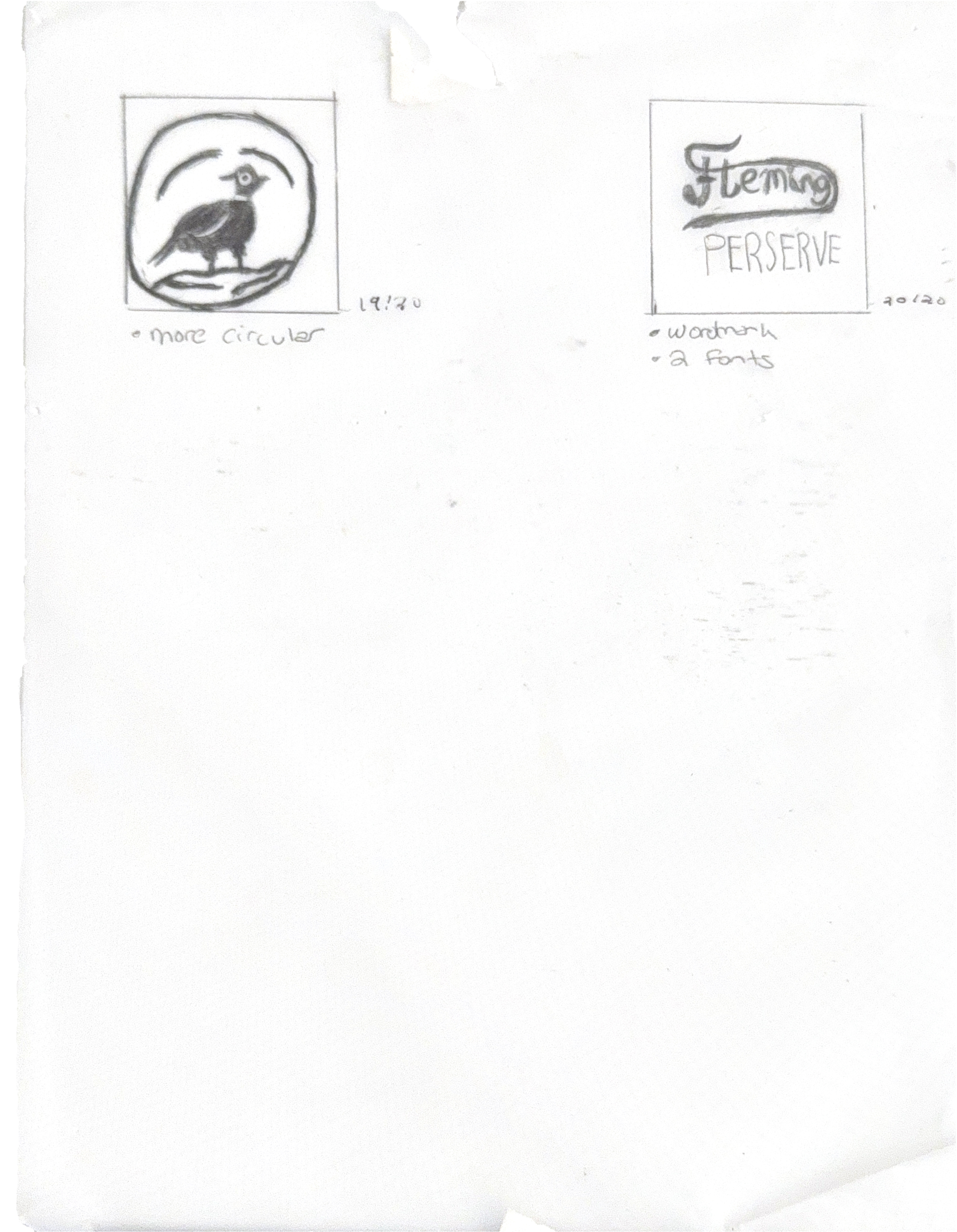
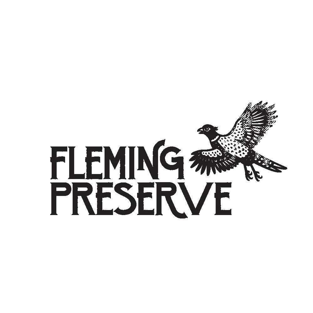
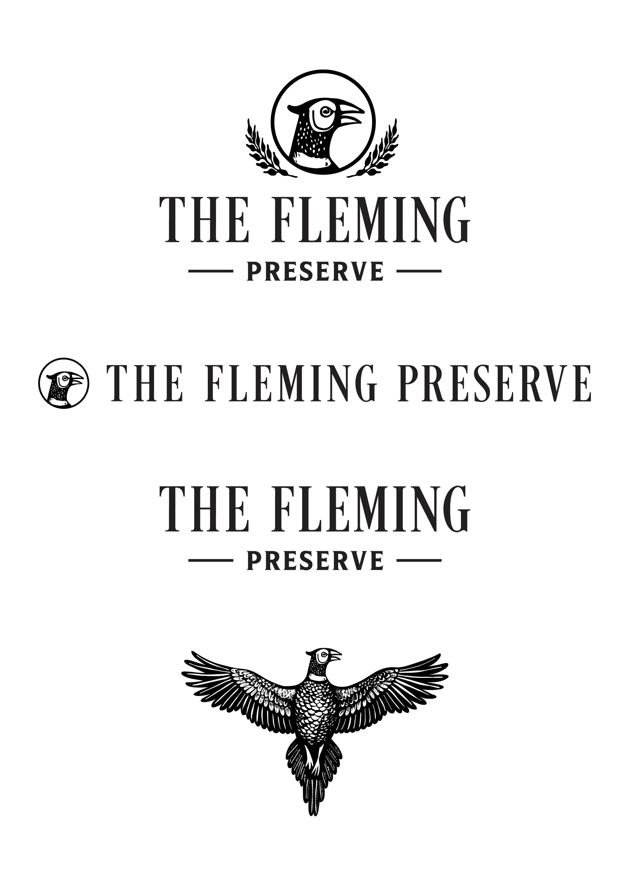
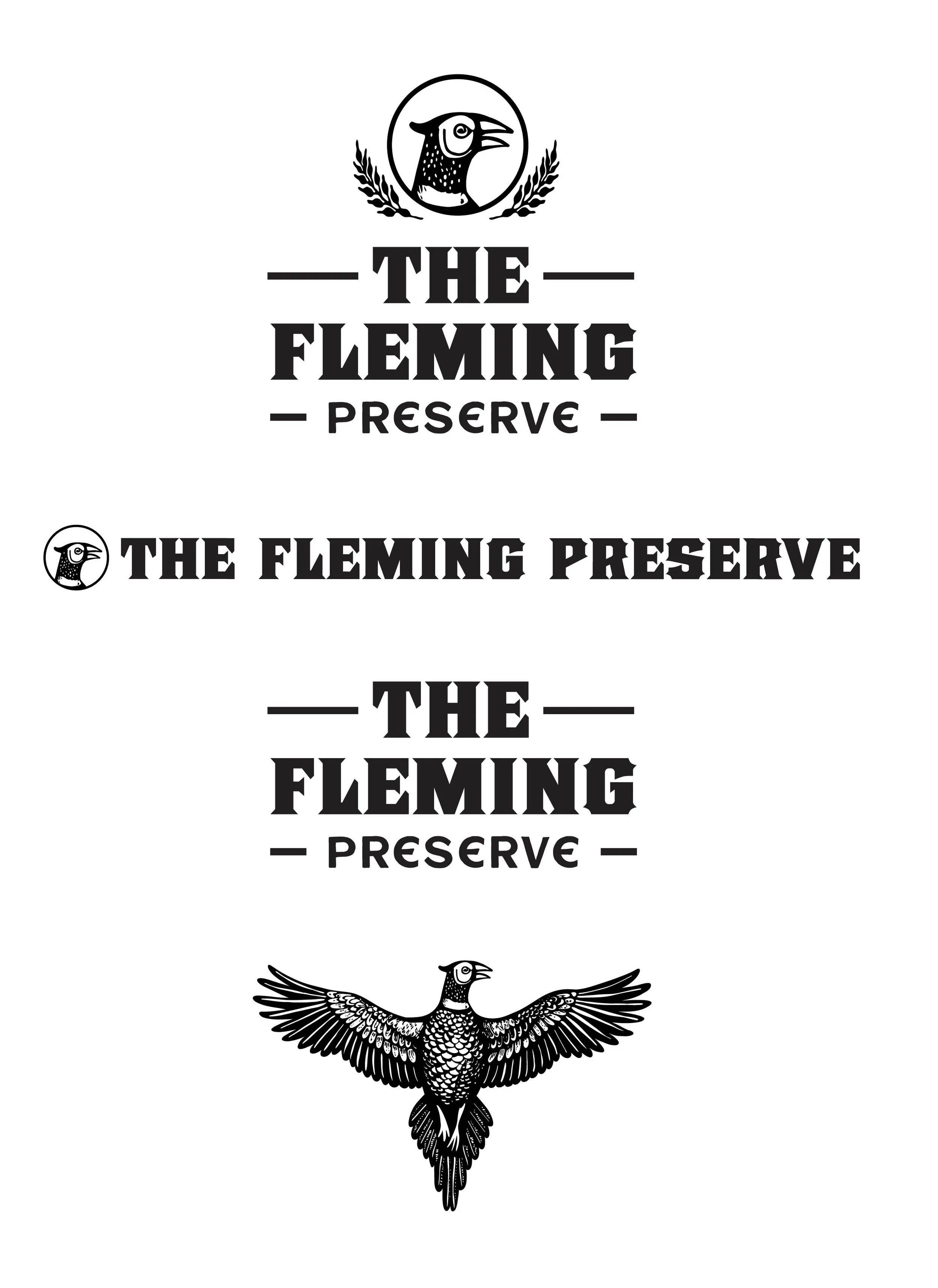
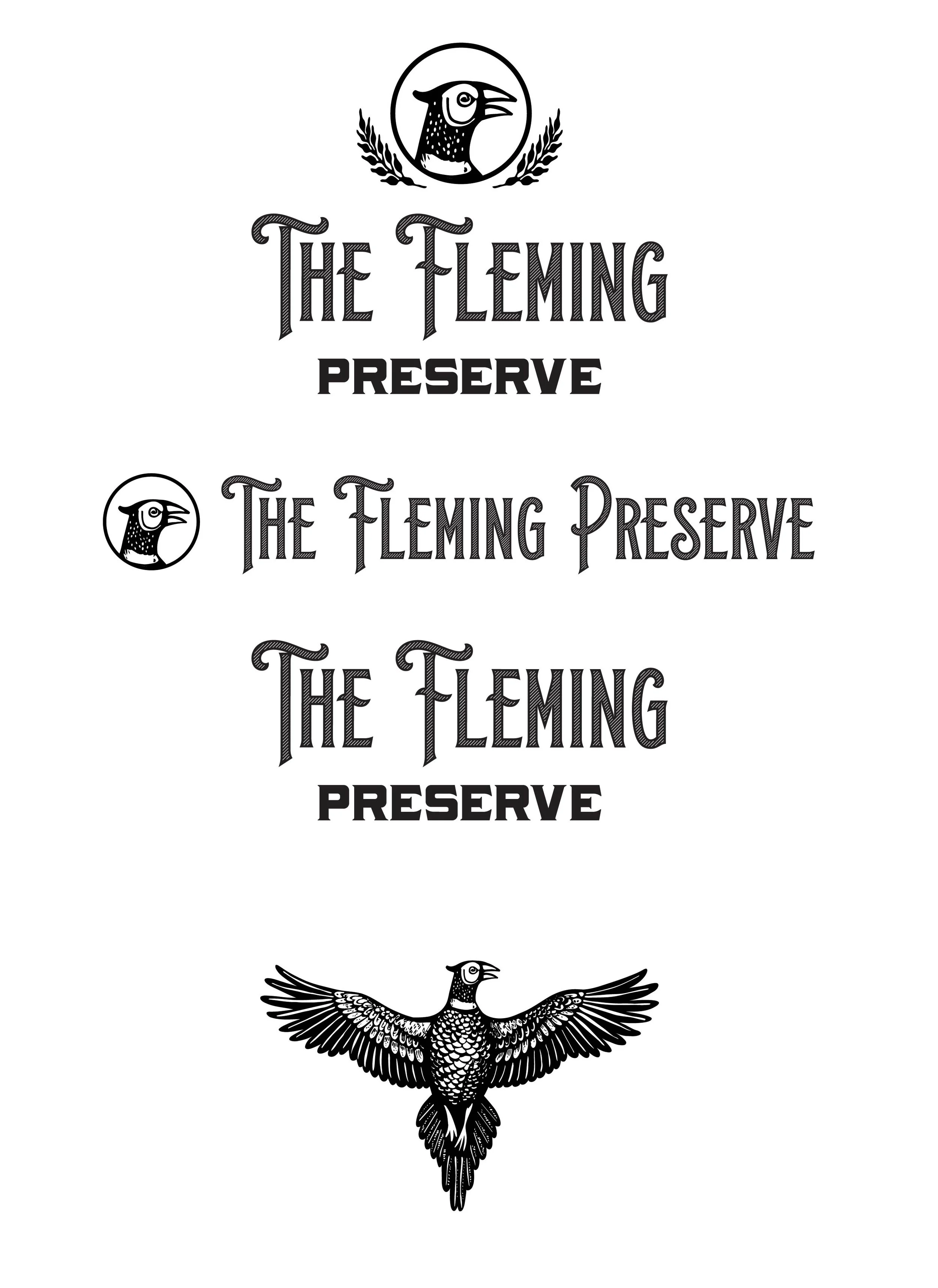
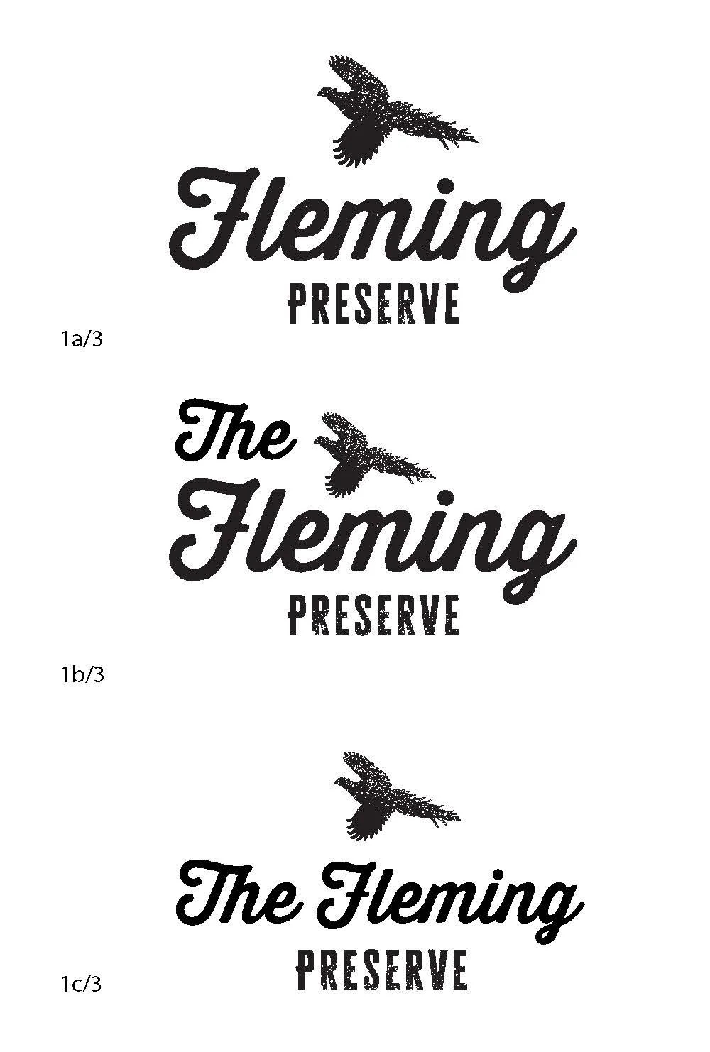
The logo for The Fleming Preserve is rendered in a classic, illustrative style reminiscent of an heirloom bourbon label, detailed, intentional, and rich with character. Its engraved aesthetic and traditional composition evoke a sense of permanence and heritage, honoring the estate’s 200 year legacy. At the heart of the mark, a pheasant serves as a refined sporting emblem, symbolizing the pursuit, tradition, and grace of the field. Refined linework, balanced typography, and thoughtful spacing create sophistication without excess. The result is a mark that feels both storied and elevated, rooted in tradition while reflecting a timeless standard of Southern sporting distinction.
Research & Development
Research and development involved gathering insights through client surveys.
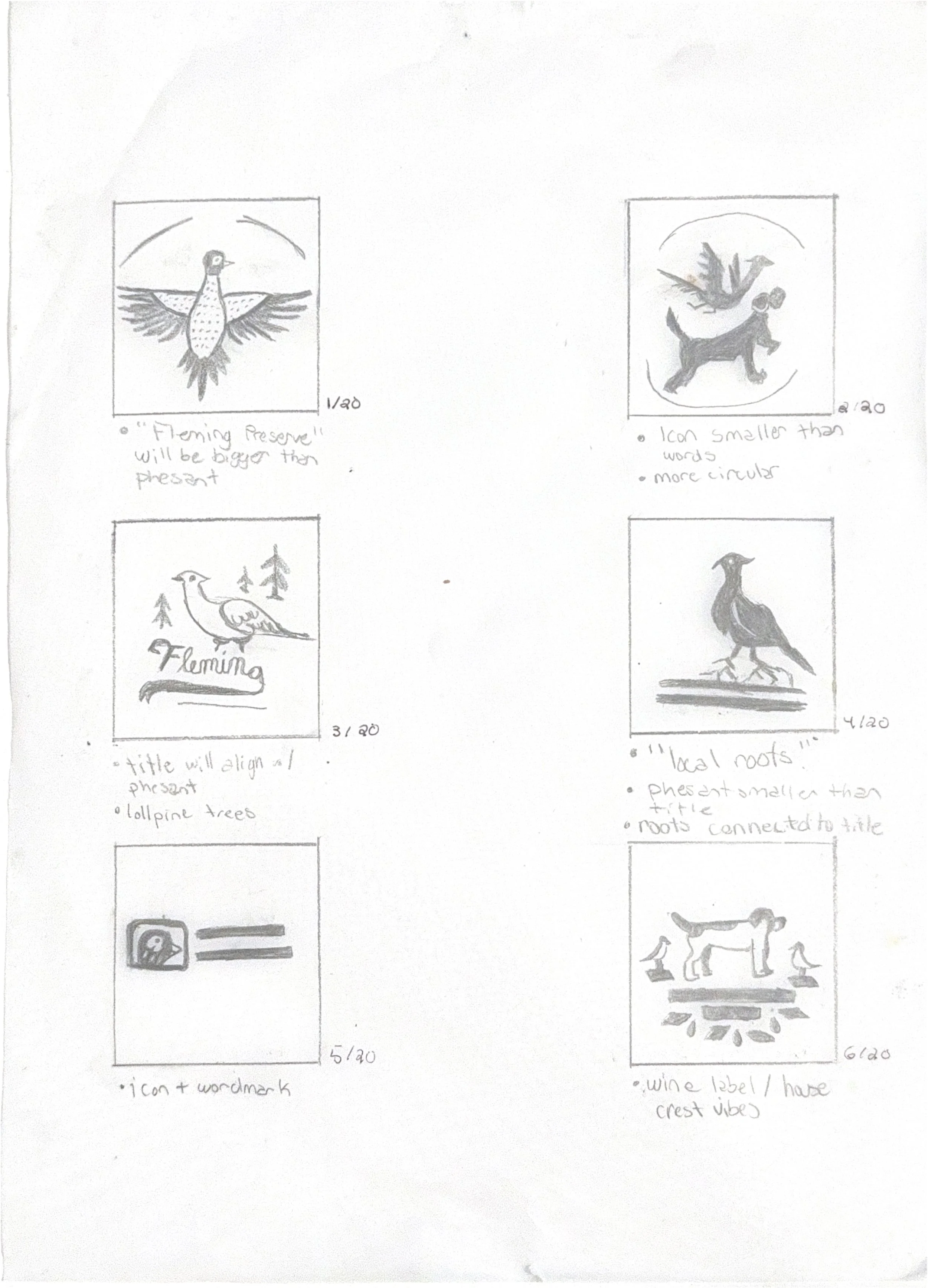
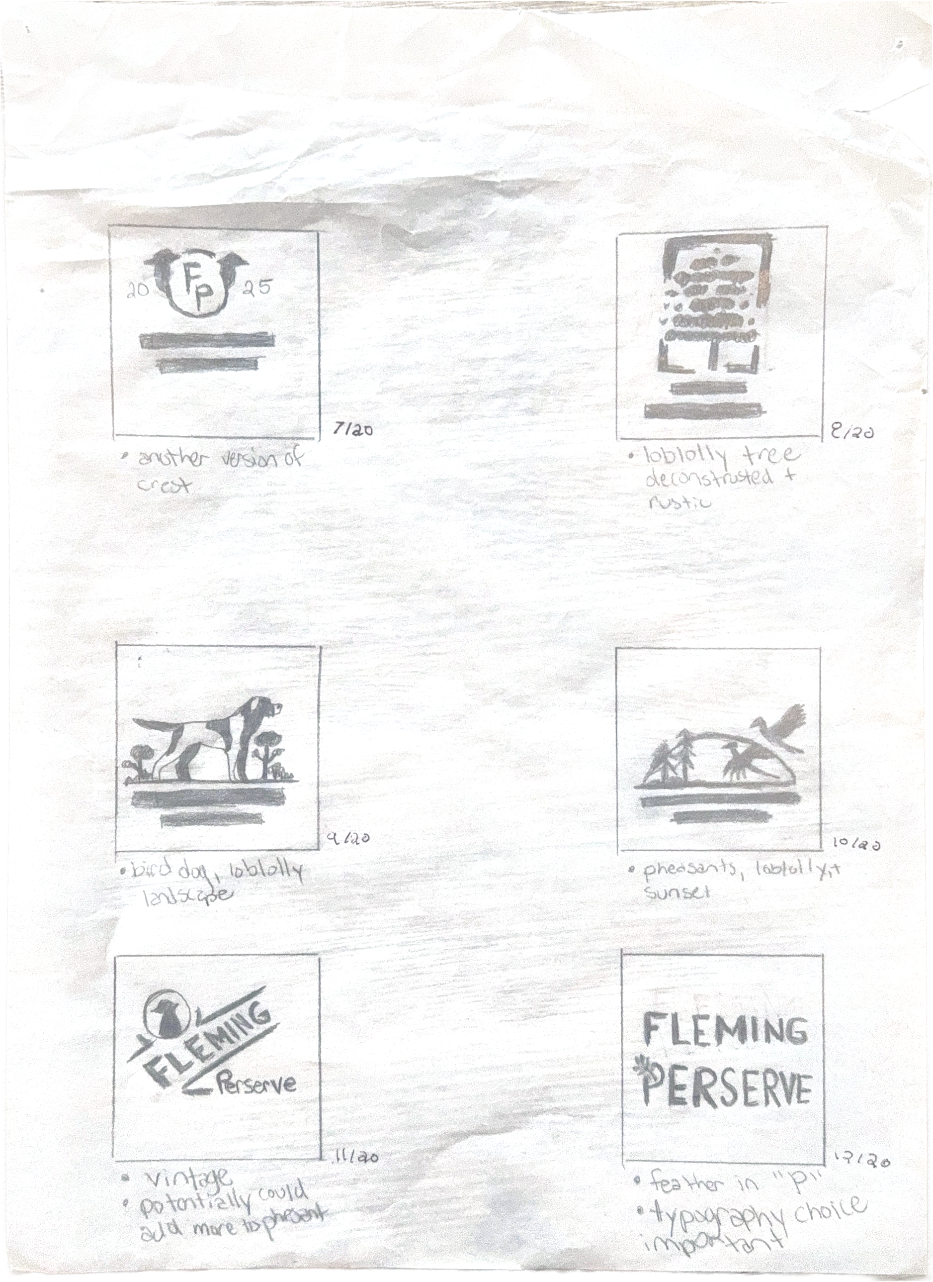
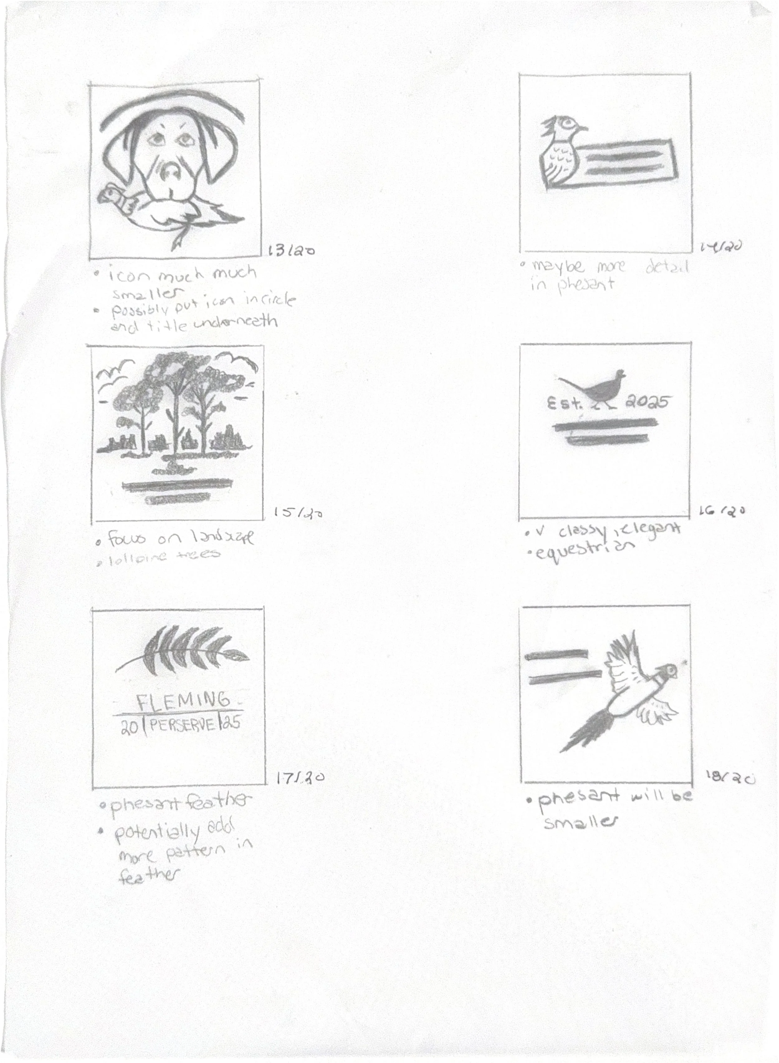
Preliminary sketches were then developed to explore initial concepts. Digital thumbnails were created to refine and visualize the strongest ideas to be reviewed by clients.
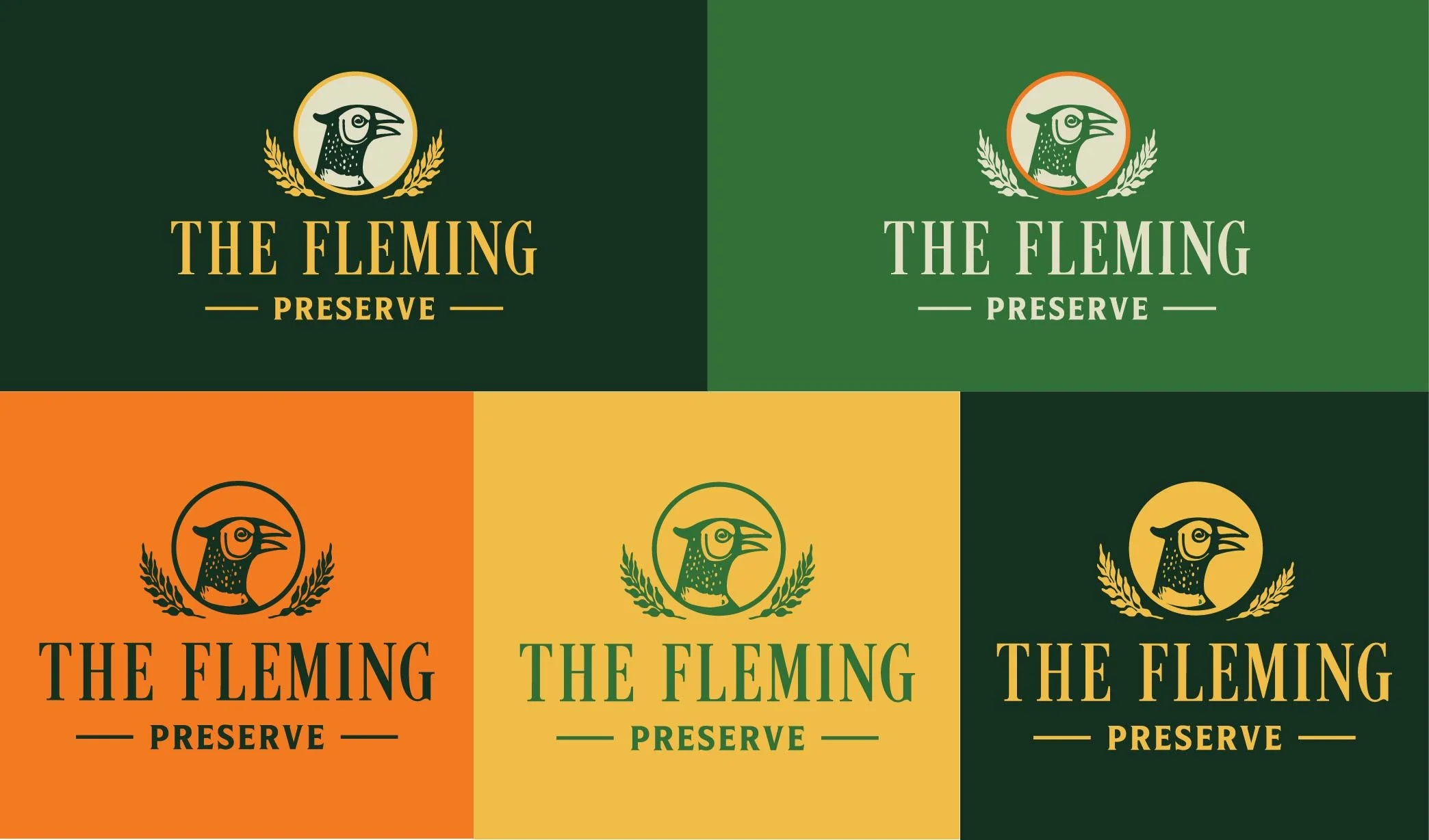
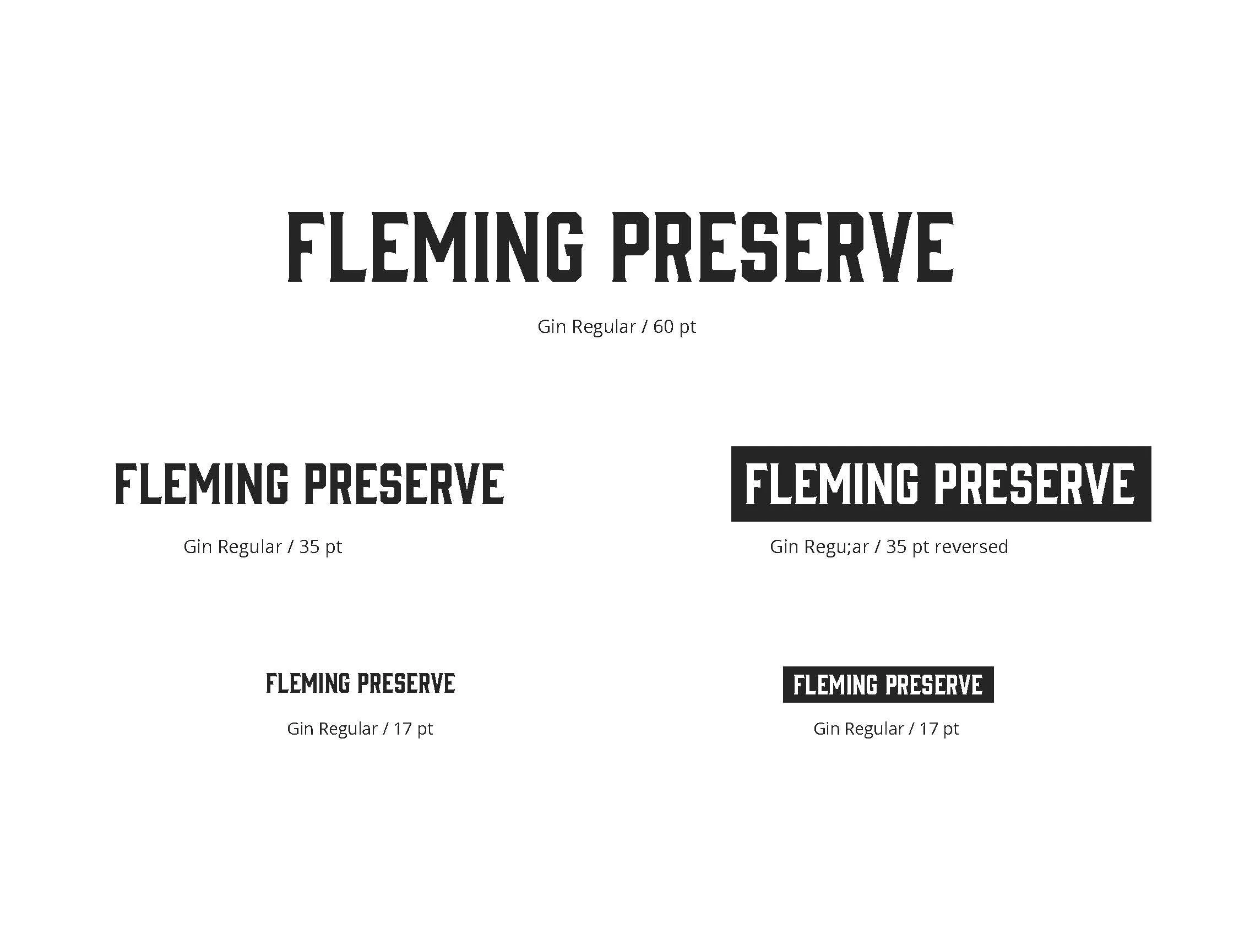
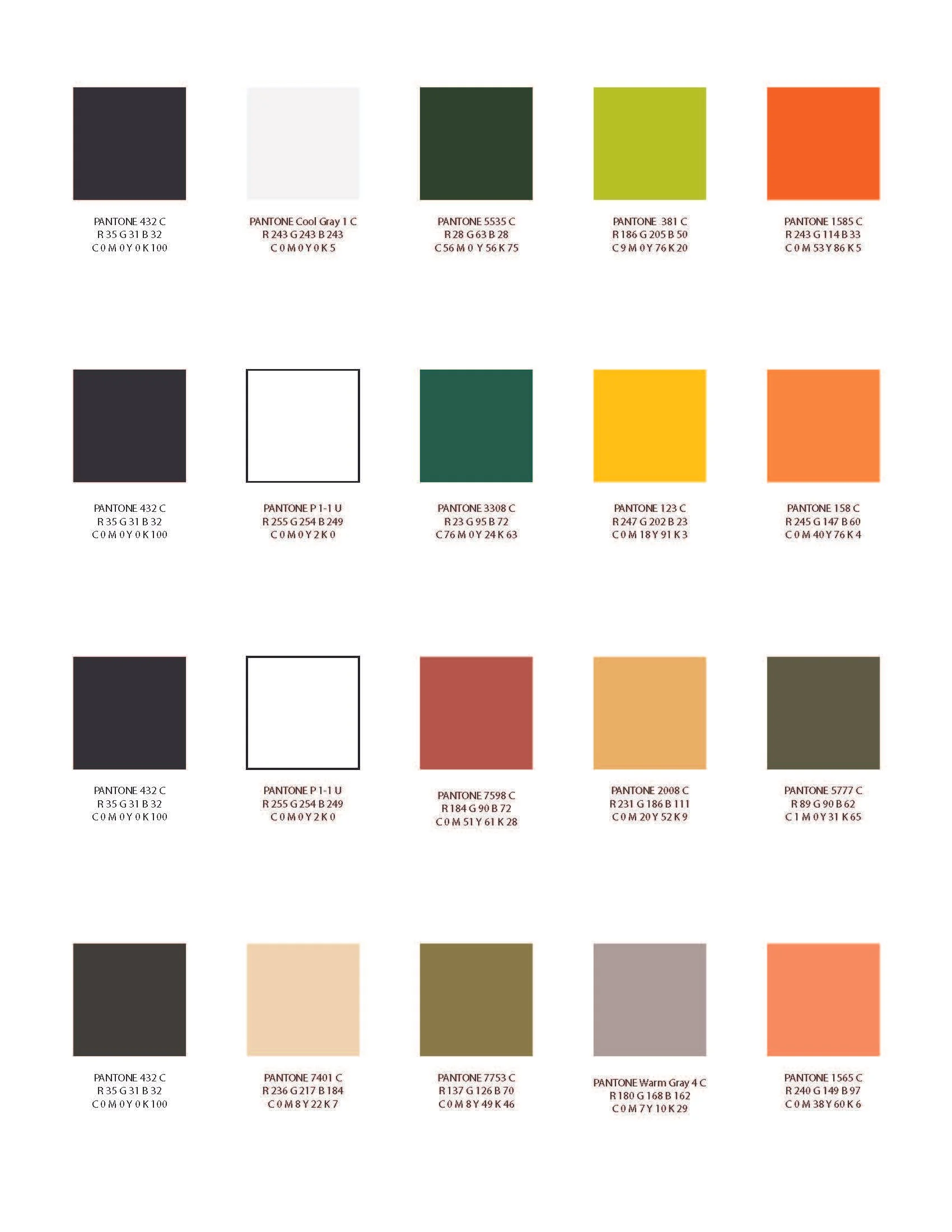
Color & Type Studies
Type and color studies were conducted to establish a clear and cohesive visual direction for the project. Various typefaces were explored to evaluate readability, tone, and alignment with the brand personality, ensuring the final selection effectively communicated the intended message. In parallel, multiple color palettes were tested to assess contrast, hierarchy, and emotional impact. These studies helped refine the overall aesthetic, resulting in a balanced and visually engaging design system.


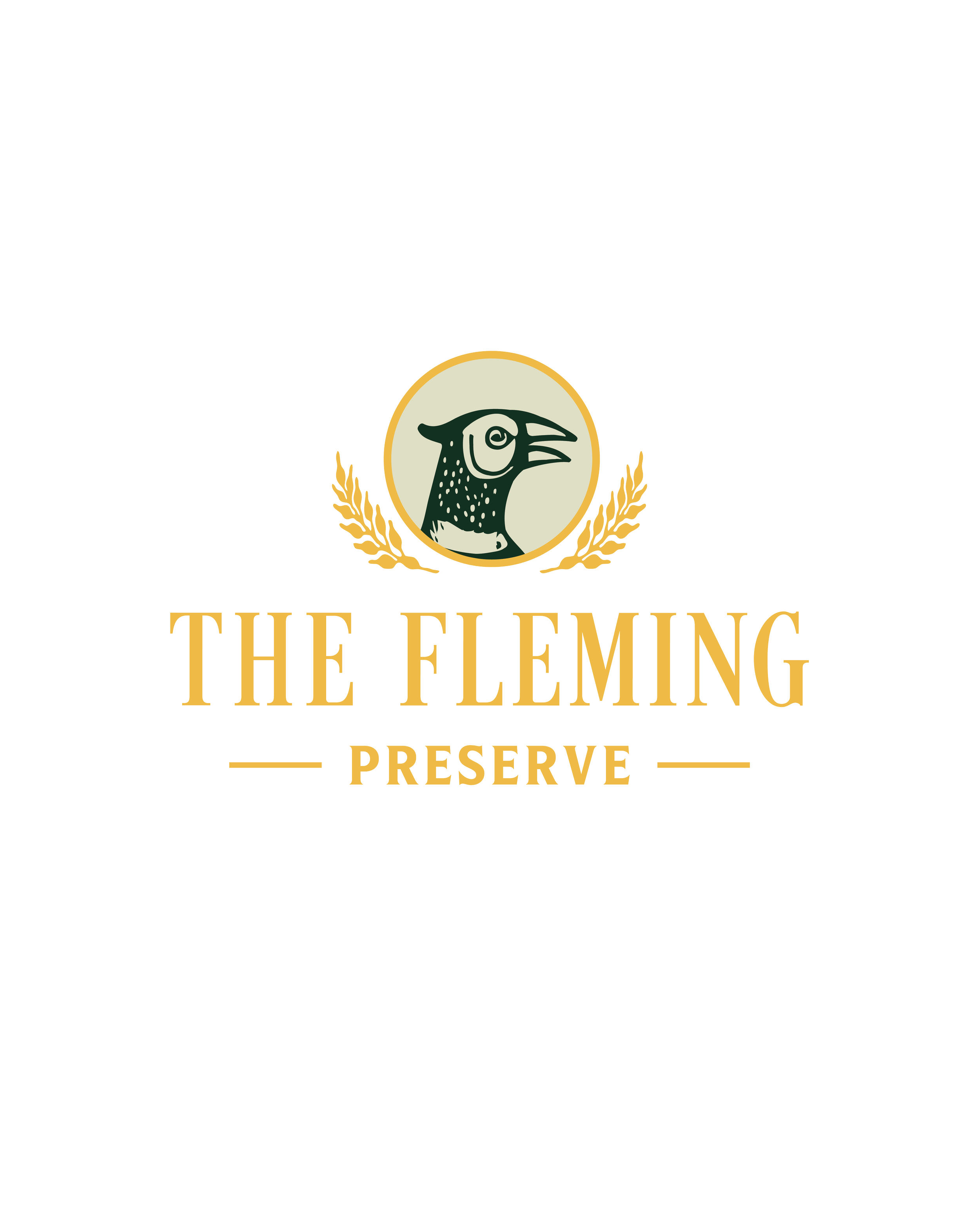
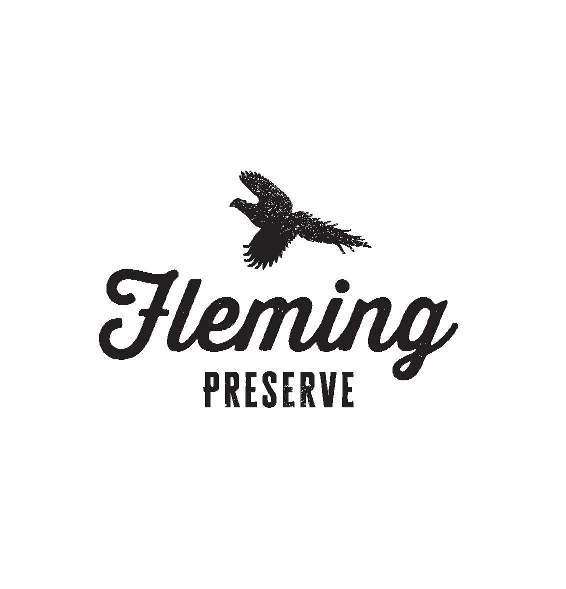
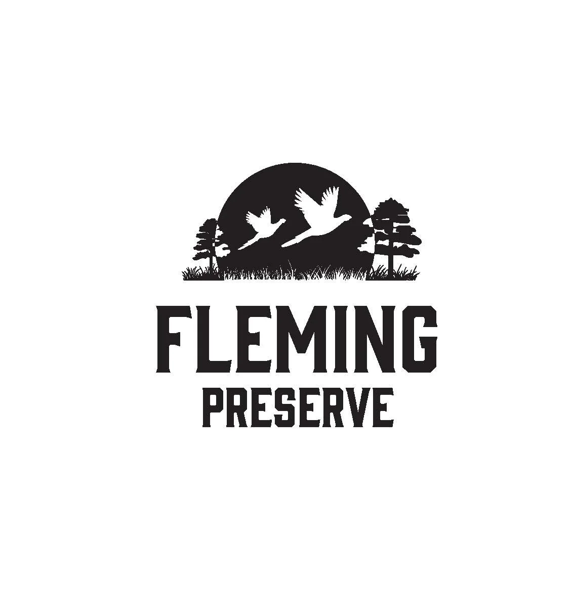
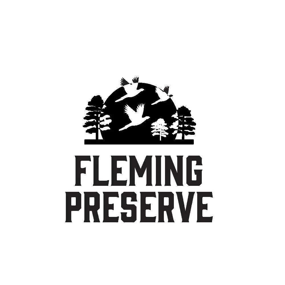
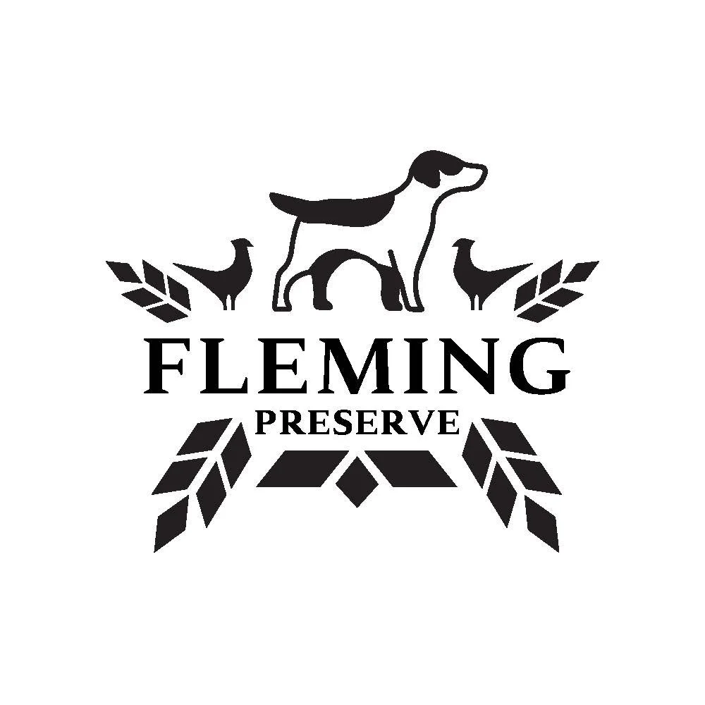
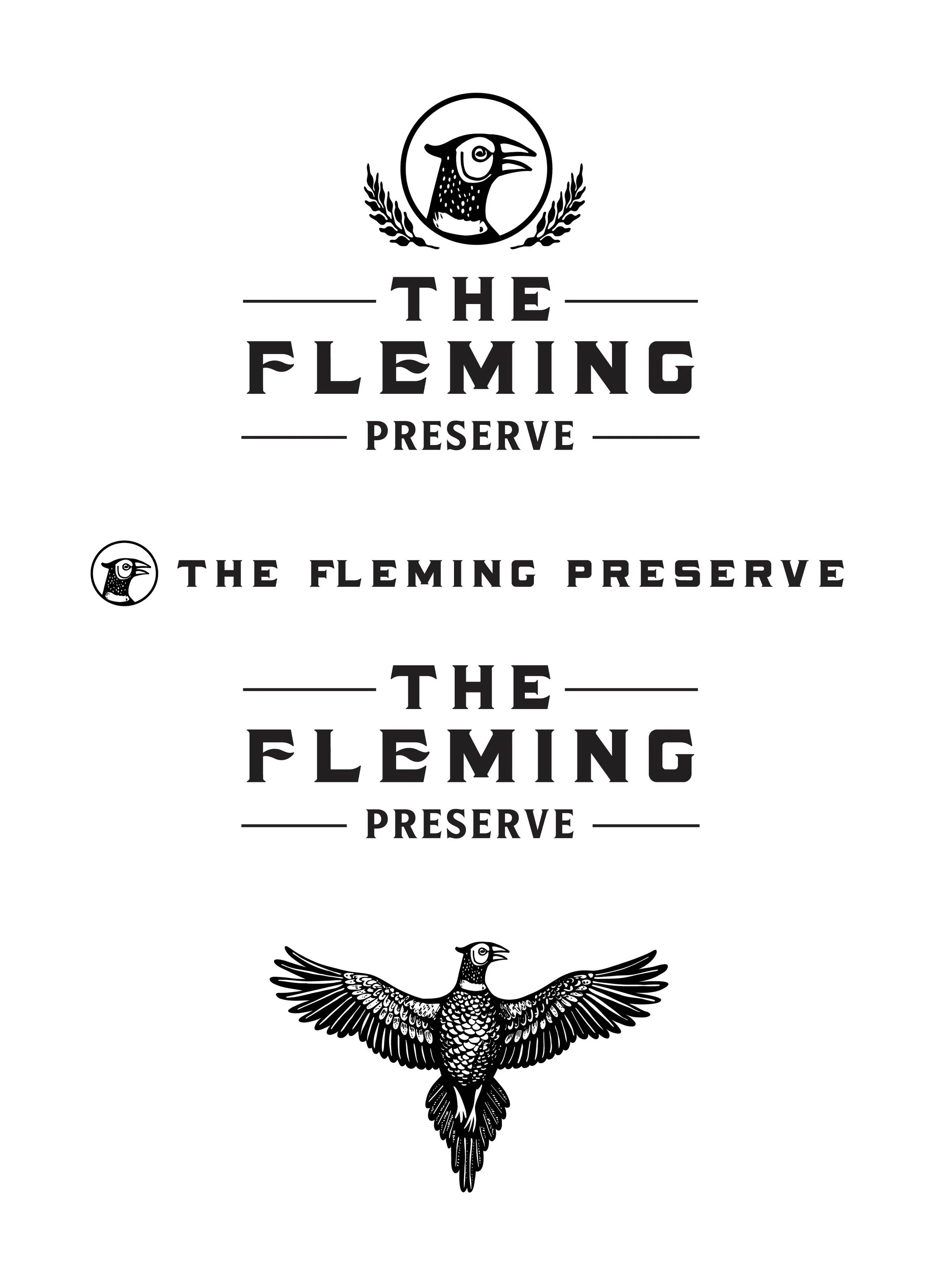
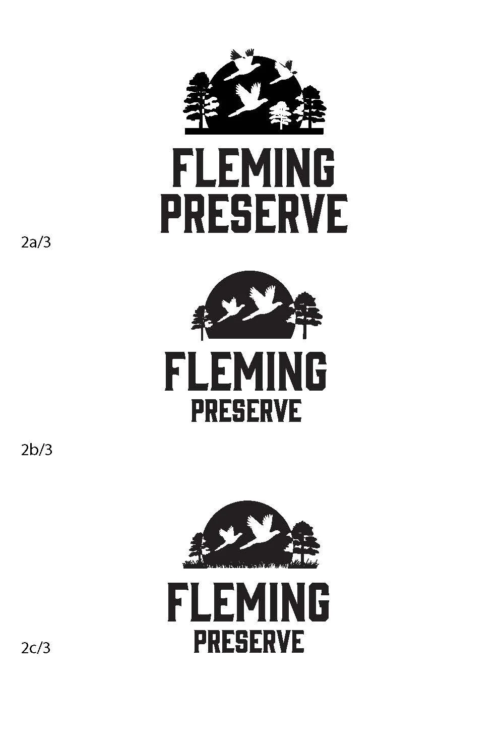
Logo Roughs & Comps
Through an iterative design process, we developed multiple internal versions of the logo and refined them collaboratively with the client. Each iteration allowed us to explore different visual directions, gather feedback, and ensure the final design aligned perfectly with the brand’s identity and objectives.
Reflection
Working on this project taught me the delicate balance between creativity and functionality in logo design. I learned how to incorporate illustrative elements that add personality and uniqueness, while ensuring the logo remains clear, versatile, and effective across different applications. This experience strengthened my understanding of how visual complexity can coexist with simplicity, and how careful iteration helps maintain both aesthetic appeal and practical usability.